In a previous post, I argued that the y-axis can be misleading under certain conditions. One of these conditions is when using a bar graph with a non-zero starting point. In this post I will show that bar graphs can be misleading even when the y-axis is not misleading.
In brief, bar graphs do not only convey certain estimates or data summaries but also an idea about how the data is distributed. The point here is that our perception of data is shaped by the bar graph, and in particular that we are inclined to believe that the data is placed within the bar. For that reason, it is often better to replace the bar graph with an alternative such as a box plot. Here is a visual summary of one of the key points:

There is a name for the bias: the within-the-bar bias. Newman and Scholl (2012) showed that this bias is present: “(a) for graphs with and without error bars, (b) for bars that originated from both lower and upper axes, (c) for test points with equally extreme numeric labels, (d) both from memory (when the bar was no longer visible) and in online perception (while the bar was visible during the judgment), (e) both within and between subjects, and (f) in populations including college students, adults from the broader community, and online samples.” In other words, the bias is the norm rather than the exception in how we process bar charts.
Godau et al. (2016) found that people are more likely to underestimate the mean when data is presented in bar graphs. Interestingly, they did not find any evidence that the height of the bars affected the underestimation. There is even some disagreement about whether bar charts should include zero (e.g., Witt 2019). Most recently, however, Yang et al. (2021) have demonstrated how truncating a bar graph persistently (even when presented with an explicit warning) misleads readers.
This is an important issue to focus on. Weissgerber et al. (2015) looked at papers in top physiology journals and found that 85.6% of the papers used at least one bar graph. I have no reason to believe that these numbers should differ significantly from other fields using quantitative data. For that reason, we need to focus on the limitations of bar graphs and potential improvements.
A limitation with the bar graph is that different distributions of the data can give you the same bar graph. Consider this illustration from Weissgerber et al. (2015) on how different distributions of the data (with different issues such as outliers and unequal n) can give you the same bar graph:
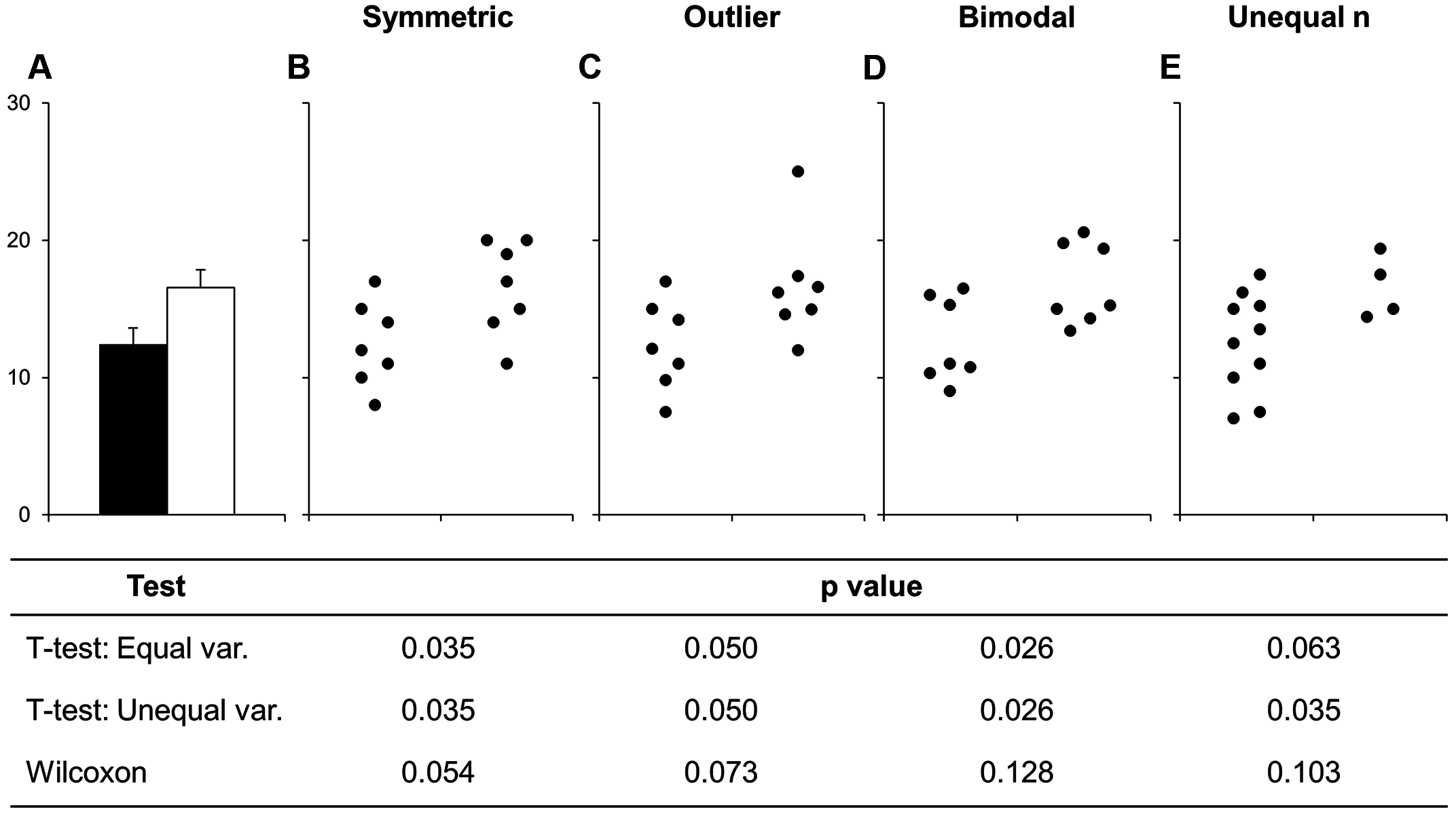
Accordingly, bar graphs will often not provide sufficient information on what the data actually looks like and can even give you a biased perception of what the data looks like (partially explained by the within-the-bar bias). The solution is to show more of the data in your visualisations.
Ho et al. (2019) provide one illustrative example on how to do this when you want to examine the difference between two groups. Here is their evolution of two-group data graphics (from panel a, the traditional bar graph, to panel e, an estimation graphic showing the mean difference with 95% confidence intervals as well):
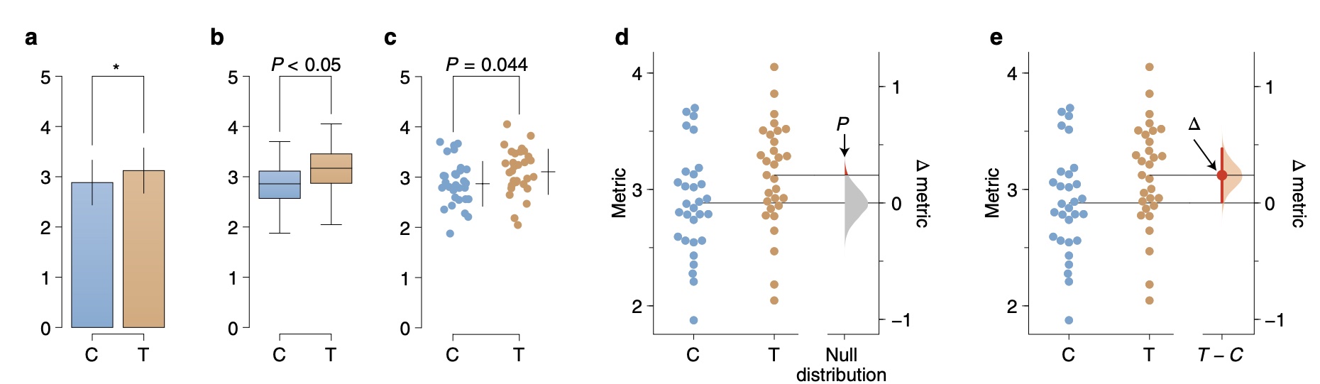
From panel a to panel b, you can see how we address some of the within-the-bar bias, and further show how the data points are actually distributed when looking at panel c. This is just one example of how we can improve the bar graph to show more of the data, and often the right choice of visualisation will depend upon what message you will need to convey and how much data you will have to show.
That being said, there are some general recommendations that will make it more likely that you create a good visualisation. Specifically, Weissgerber et al. (2019) provide seven recommendations where I find four of them relevant in this context (read the paper for the full list as well as the rationale for each):
- Replace bar graphs with figures that show the data distribution
- Consider adding dots to box plots
- Use symmetric jittering in dot plots to make all data points visible
- Use semi-transparency or show gradients to make overlapping points visible in scatter plots and flow-cytometry figures
Bar graphs are great, and definitely better than pie charts, but do consider how you can improve them in order to show what your data actually looks like beyond the bar.