Anscombe’s quartet highlights the importance of data visualisation when interpreting the relationship between two variables. That is, a simple correlation coefficient is not sufficient to understand the relationship between two variables. We want to see the data. For a great example on the many different data patterns that can lie behind a correlation coefficient, check out this post.
Can we always look at a data visualisation to better understand what is actually going on in the data? We might be better off understand relationship by looking at data visualisations than by looking at the numbers in a table. This is often the case for effect sizes, where we expect that stronger correlations should be more visible. This is of course best illustrated in the game Guess the Correlation.
However, there is a problem with this approach. There can be a strong correlation between two variables without a strong visual correlation. In other words, just by visualising the relationship between two variables, you do not necessarily get a correct understanding of whether there is a correlation between two variables.
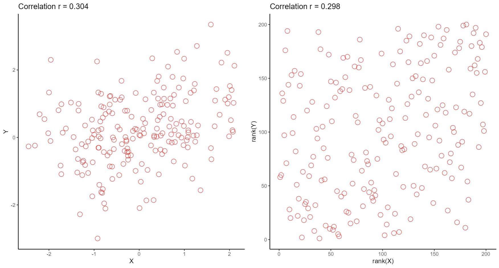
Richard McElreath shared a great example of this on Twitter where he, by taking the rank the data, makes the correlation between two variables difficult, if not impossible, to see. Because it is difficult to see a systematic relationship between two variables, it is easy to mistakenly conclude that there is no strong correlation. Steve Haroz also provided a great visualisation of this on Twitter:

In this example, we can see in the right panel how a correlation around .3 looks like a correlation around 0. Accordingly, we cannot always easily correlations as effect sizes in data visualisations. More importantly, while the two correlations are almost identical, most people would – when only presented with the visualisation of the data, conclude that the correlation in the left panel is much stronger.
What I like about this example is that it confirms that there is no universal approach to analysing data. Specifically, the purpose of the visualisation above is not to deny the importance of data visualisation and focus more on summary statistics and tables. Instead, the examples above highlight the importance of doing both. The more ways in which you can analyse your data, the better able you are to interpret correlations as effect sizes.