The pie chart is more than 200 years old. And I am sure people will use pie charts 200 years from now (cf., the Lindy effect). It is a popular chart type and I am not universally against using pie charts. However, in most cases – especially in academic publications – the pie chart is not the best choice.
Specifically, often we are simply better off not providing a figure at all or turning the pie chart into a bar chart. I will provide an example of both these cases. First, to understand why no chart at all might be better than a pie chart, I will show the full context of a pie chart from this article to illustrate the issue:
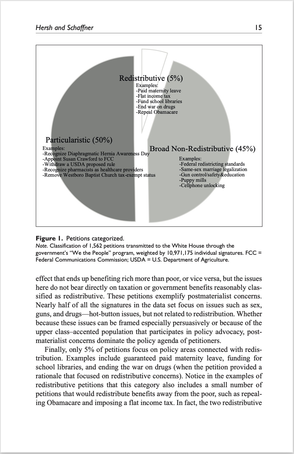
As you can see, the pie chart and the figure legend take up more than half of the space on the page (and the text on the page is then used to comment on what the figure is showing). The pie chart is adding nothing of value here that couldn’t be described in a few sentences, including the examples highlighted for each category in the pie chart. Accordingly, even (or especially) when pie charts are quite simple, their shape makes them take up more space than simply adding a few lines of text. Of course, in some settings, such as in PowerPoint presentations or tweets, text can be a problem and a pie chart like the one above might be a useful way to illustrate the information of interest.
Second, when we add more categories to a pie chart, the visualisation will only be even worse. That is, when we want to show more information, the pie chart is not the ideal choice. Consider a figure from this article on the occupations of members of Congress:
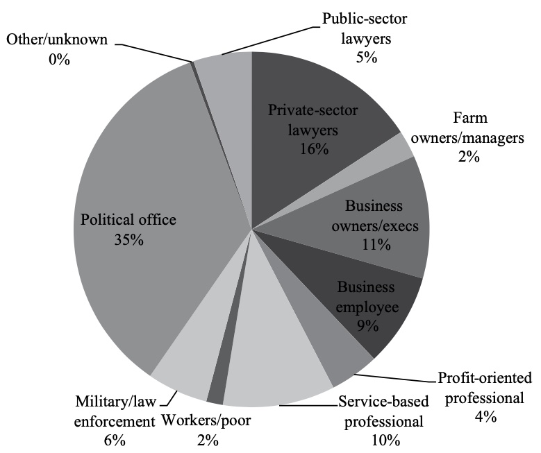
There are at least three issues with the pie chart in question. First, and most importantly when we look at pie charts with multiple categories, it is very difficult to compare the relative size of the different categories. Second, pie charts often use different colours for the different categories. However, the colours are not adding any information and it is almost impossible to read the “Business employee” category. Third, notice how “Other/unknown” is 0% but still have a non-zero sized piece of the pie. It might be a rounding issue but it is not looking good.
To address all of the three issues, we can create a simple bar chart showing the same information:
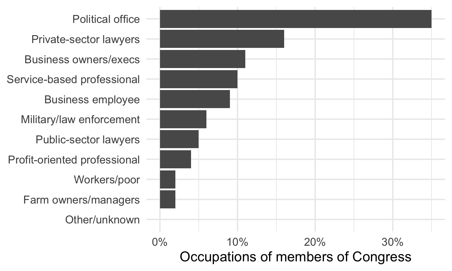
This figure makes it a lot easier to compare the different categories, works well in black and white, and do not need to use any ink to show a value of 0%.
Pie charts are not always bad, but make sure that you consider whether your pie chart is actually better than no pie chart at all or better than an alternative chart (such as a bar chart).