In a blog post at Datawrapper, Vivien Serve goes through all the entries included in their Data Vis Dispatch throughout 2024. The year had several significant elections, leading to a series of visualisations related to elections, including the visualisation of opinion polls. I went through all of them and in this post I will focus on the visualisations of opinion polls and provide my own subjective ranking.
The idea is to provide a bit of inspiration on how to visualise data from opinion polls, and in a few cases provide a few points on what to avoid. While I might rank a visualisation higher than another, try not to pay too much attention to the individual placements. That is, the visualisations closer to the top are better than those to the bottom, but just because a figure is one or two places above another visualisation, it is not necessarily significantly better. Also, as these figures have all been covered in the Data Vis Dispatch, you will not find any ridiculously bad visualisations. Accordingly, a visualisation ranked low is not necessarily a bad visualisation in my view.
A few notes before we begin. First, I do not have a systematic method for the inclusion of visualisations. Accordingly, you can most likely find several visualisations included in the Data Vis Dispatch which I do not consider here. For example, visualisations in non-English languages are less likely to be considered here. Second, I primarily evaluate the visualisations as static visualisations. A lot of the visualisations have interactive features but these are not considered in a consistent manner here. With these caveats out of the way, let us begin. Third, good visualisations are rarely good on their own but should be seen in a wider context/coverage. I pay little to no attention to this context here. Fourth, I only cover opinion polls based upon “real” data, and not illustrations with simulated data (see, for example, ‘Election Polls are Fuzzy. We Explain With Kittens‘ from The Wall Street Journal).
One thing to keep in mind is that I end up repeating myself a bit which might capture a personal preference more than an objective criticism of a lot of these visualisations. For example, I would in general like to see a lot of these visualisations do a better job at visualising uncertainty (i.e., model uncertainty or margin of error). For other visualisations I do not really have a lot to say, except for the fact that the visualisation is … fine.
I can also see that there is a bias towards visualisations showing the results from multiple polls at once. This can be in the form of weighted averages (i.e., models including data from several polls) or visualisations showing numbers from polls over time (e.g., the attitudes of the electorate throughout the years). This is only fair as I believe such visualisations are, on average, of much greater interest than the results from a single poll.
Let us get started.
The Financial Times: One week to go: what is the state of the US presidential race?
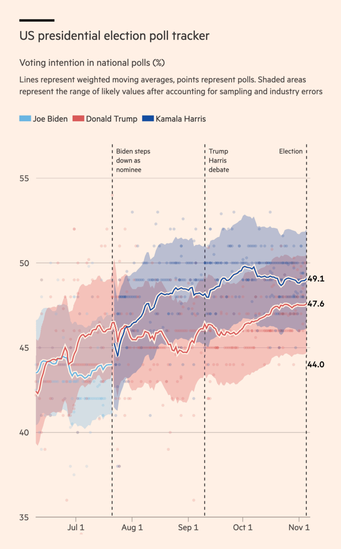
This is a good visualisation of the polls as it emphasises the uncertainty around the estimates with the shaded areas. There can be a trade-off between how much attention you want to pay to individual polls and the uncertainty in the weighted average (i.e., the bigger and more clear the dots of the individual polls, the less the attention to the model uncertainty), especially if the uncertainty interval is small, but this is simply good work (also taking the actual polling error into account). The dashed lines also provide some context to the movement in the polls (or the lack hereof).
One minor limitation of the data is that a lot of the polls round the numbers (e.g., you see a lot more polls reporting 50% than those reporting 49.9% or 50.1%). This can make it difficult to get a sense of how many polls we are actually looking at on specific days, especially when we get closer to Election Day. I am not sure whether they have played around with the jitter of the dots in previous iterations of the visualisation, but introducing a bit of small random variation along the y-axis for rounded polls could make it easier to see the temporal distribution of the polls.
The Economist: Who will control the National Assembly?
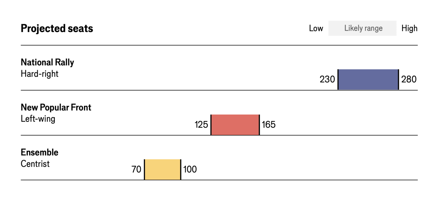
For the 2024 French elections, The Economist made several visualisations, and this is an example of the projected seats in their forecast (based on the polls). What I like about this visualisation is not only its simplicity but also its focus on the likely range and not a point estimate. While creating a forecast involves many technical details, the reporting of the key figures need not be more than a few key numbers (and then the details can be in the methodological appendix for those who are interested in the details).
Washington Post: Who is ahead in 2024 presidential polls right now?
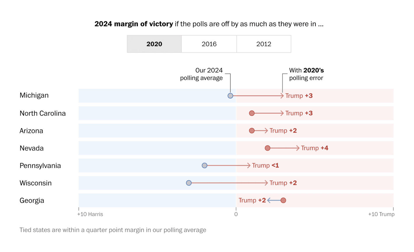
In their coverage of the 2024 presidential polls, The Washington Post – among other things – enabled their viewers to examine what the polling should show in battleground states if there were polling errors around the same magnitude as in previous elections. While there is no reason to expect that polling errors will be the same from one election to the next (as pollsters try to improve their methods due to such errors), they can be useful to consider to better grasp the uncertainty when polling specific states.
Accordingly, the good thing about this visualisation is not only the figure itself, but also the context in which it is being used, where it is also possible to see what would change if the polls underestimated Trump support by, say, 4 points. This is an interesting way to communicate uncertainty in the polls and something I would like to see more media outlets experiment with in the future.
The Financial Times: The problem with polling America’s young voters
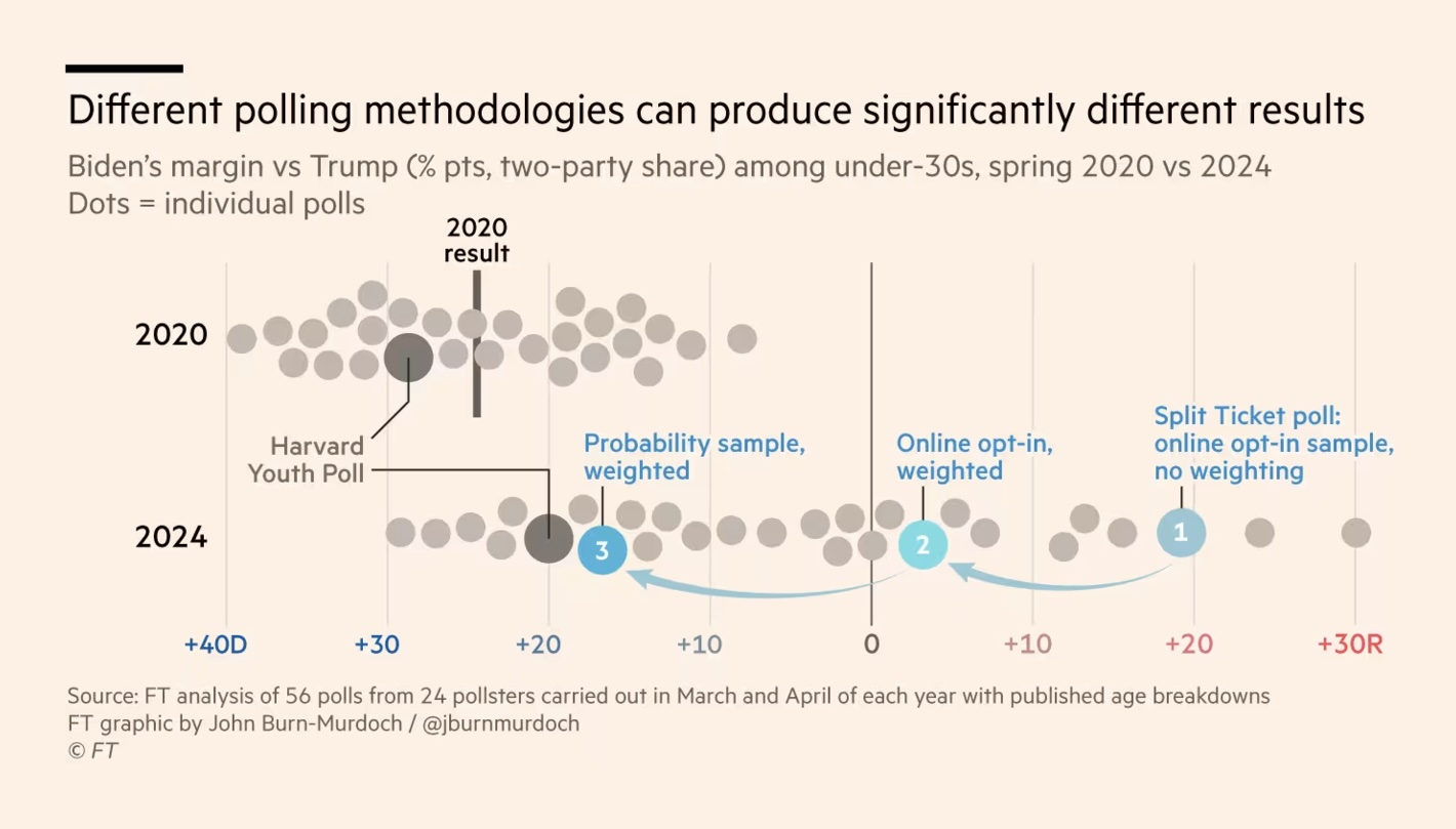
A great visualisation of the relevance of polling methodologies in explaining the differences in what polls show. That is, there are systematic differences between polls and we can disentangle the house effects and understand how specific techniques contribute to differences between pollsters. I had a similar idea years ago for Danish polls, but it was simply not possible (too few pollsters, limited details on methodologies, etc.).
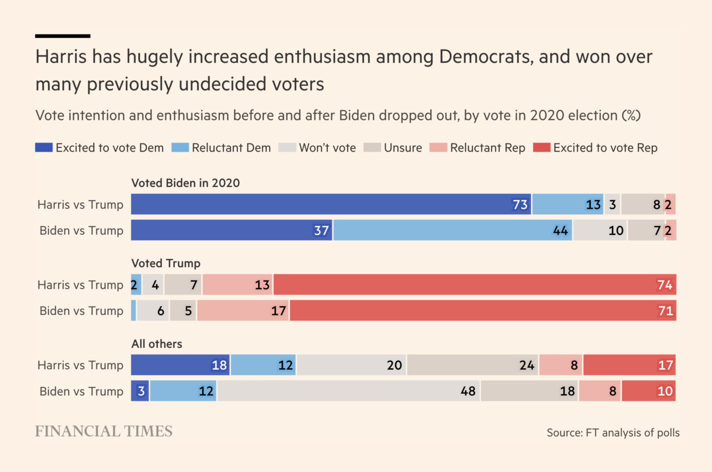
Bloomberg: Biden’s Gains Against Trump Vanish on Deep Economic Pessimism, Poll Shows

Yet another visualisation that manages to show the results from multiple polls over time including the margin of error. This makes it easy to compare the different states over time including information on who is ahead. It does not need to be more complicated than this.
The Guardian: UK general election opinion poll tracker: Labour leading as election looms
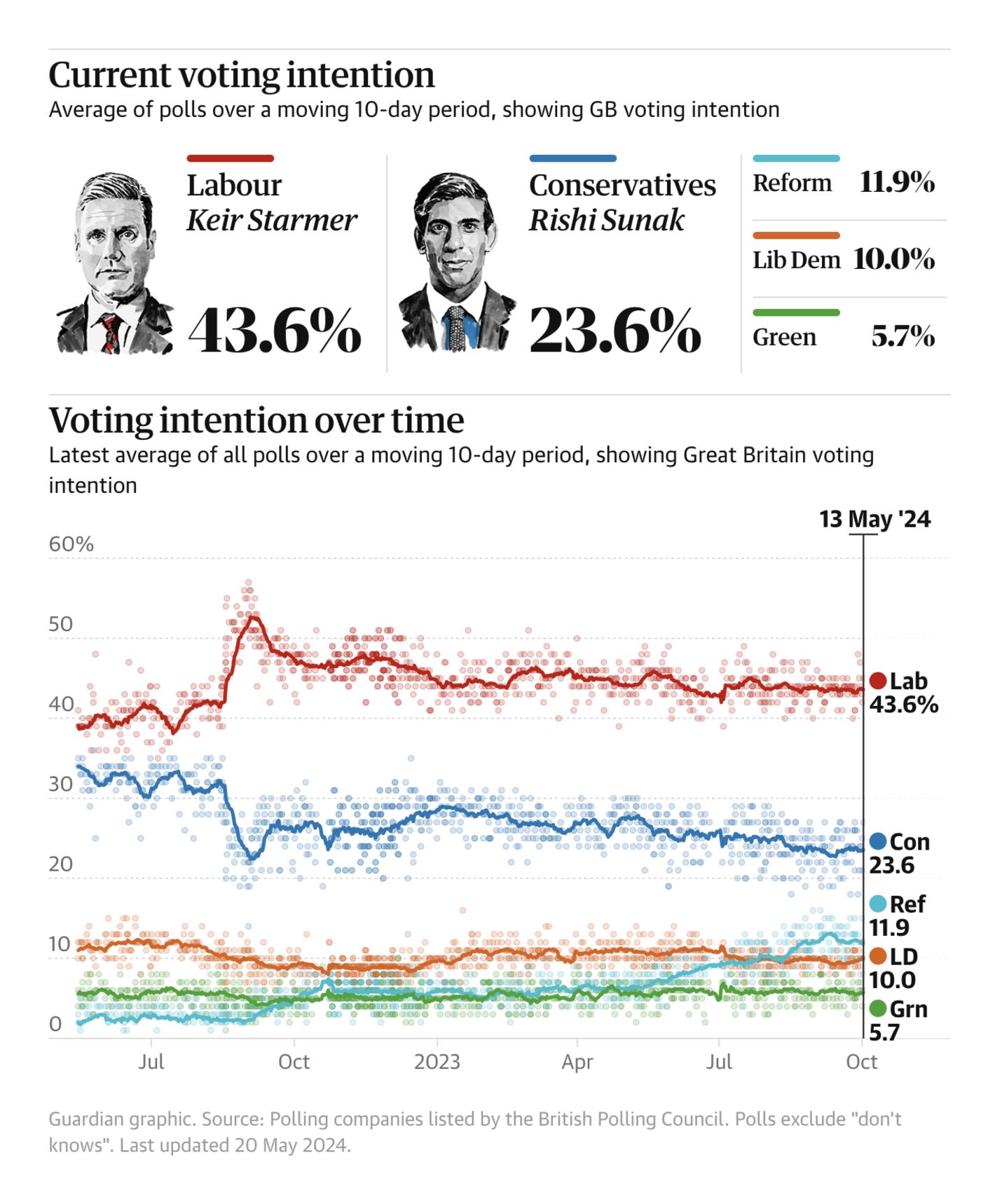
This is a simple yet effective visualisation of the polls over time in Great Britain. The number of polls and the variation in the polls make it less important to show uncertainty in the poll average. Specifically, the individual polls show this random noise in an efficient way. Similarly, it is easy to see in the visualisation who is ahead (and by how much).
Bloomberg: Two Weeks Out, Trump and Harris Are Locked in a Dead Heat
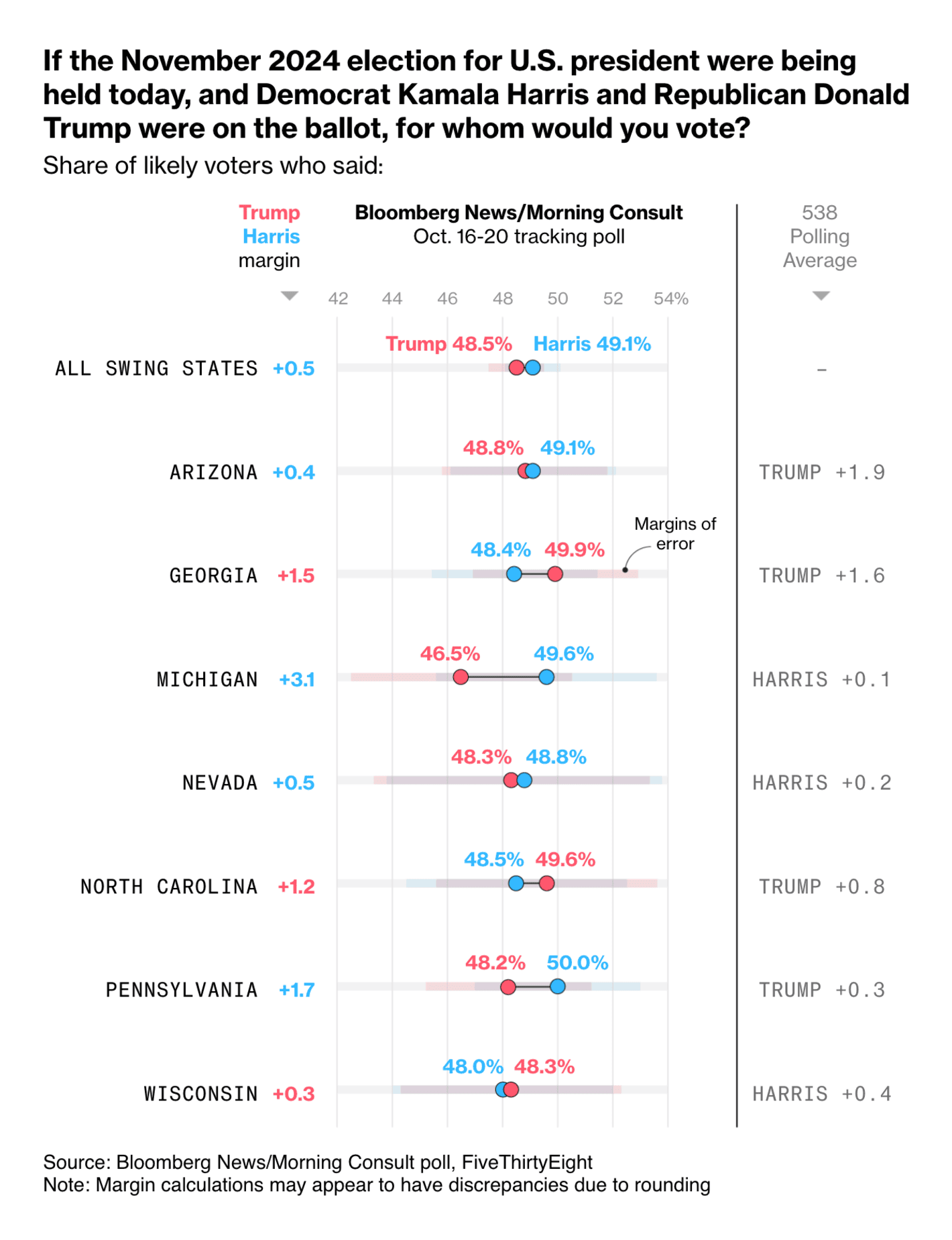
This is such a great way to visualise the results from a single poll. You have the results from different states presented with the margin of error and the margin between the two candidates, but you also include the information on the polling average (in this case from the 538 Polling Average). I really like it when the visualisation of a poll also manages to provide the context in the form of the average of other polls.
The Economist: A changing British electorate is propelling Labour towards victory
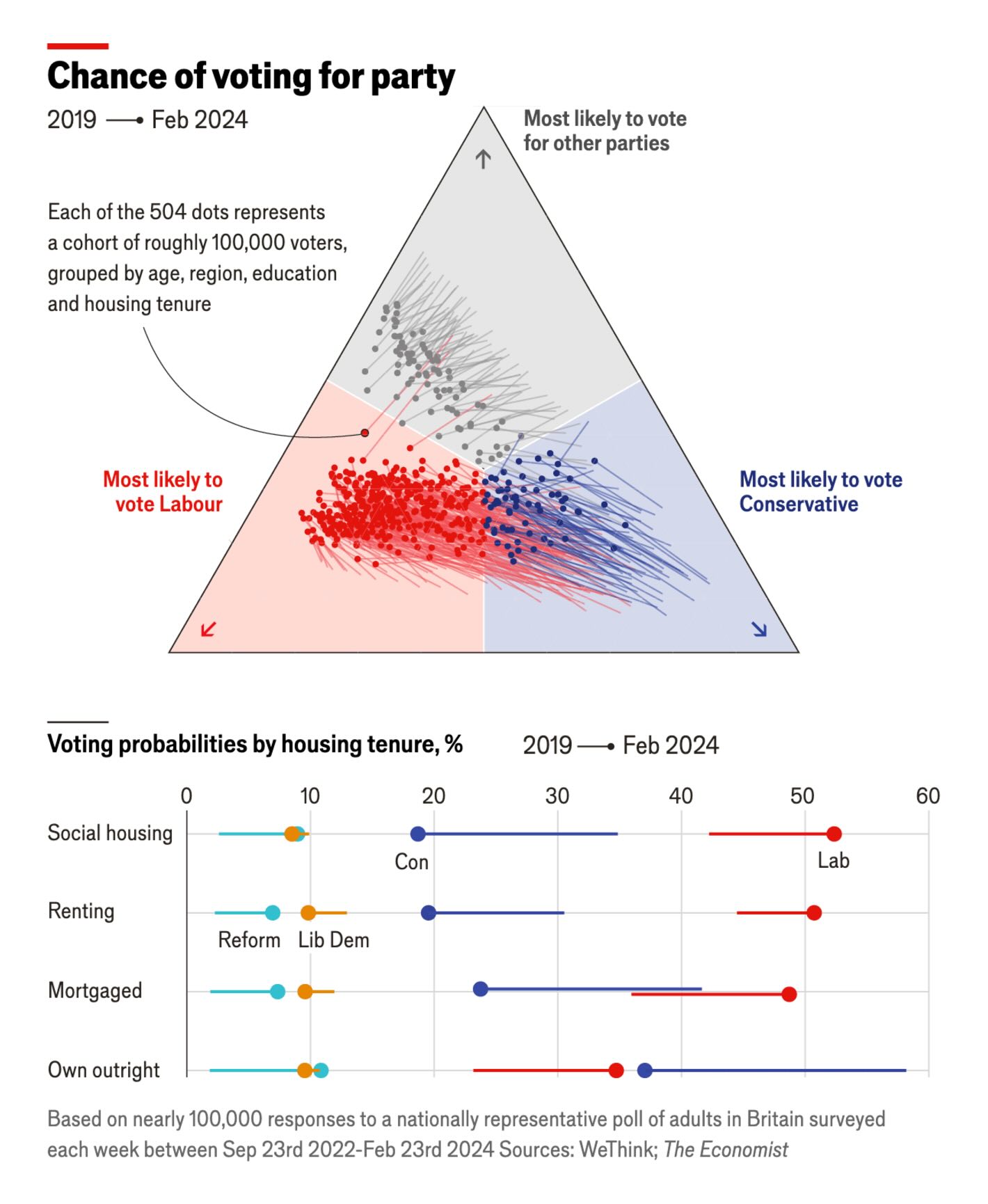
Not necessarily the best way to show trends in polls but I like this one as it shows how people across various groups are all moving in the same direction (i.e., less likely to vote Conservative and more likely to vote Labour). It would be difficult to show this in a line graph.
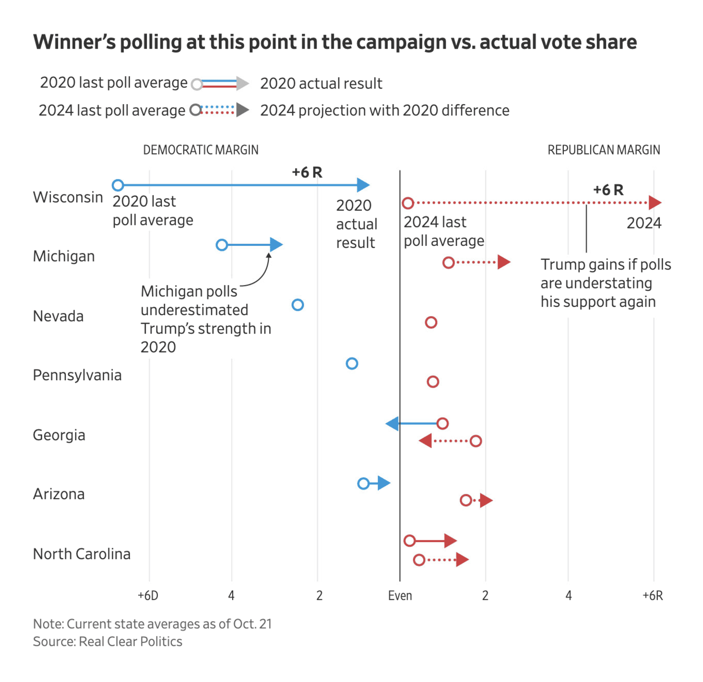
The New York Times: How Accurate, or Off-Target, Could the Polls Be This Year?
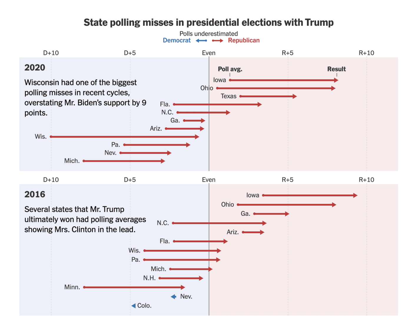
Another good overview on polling misses in key states in 2016 and 2020. There is just the right amount of text in the figure to ease the interpretation and the key point is clear without having to look at any specific numbers.
The New York Times: Election 2024 Polls: Harris vs. Trump
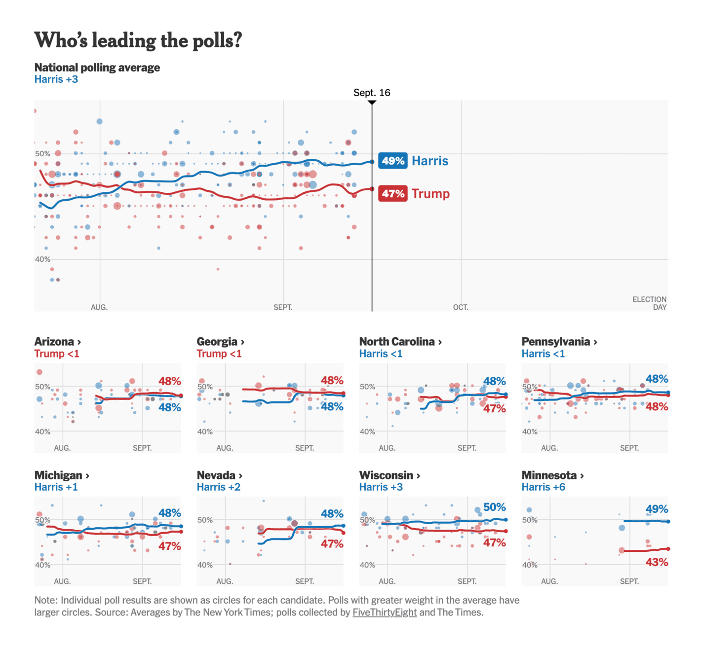
A great summary of the polls with explicit focus on how not all polls are treated equally (as the size of the individual polls are shaped by how much weight they are given in the average). That being said, it is difficult from the visualisation alone to really understand how much of an impact the weights have on the average.
The New York Times: How Support for Britain’s Conservative Party Is Collapsing
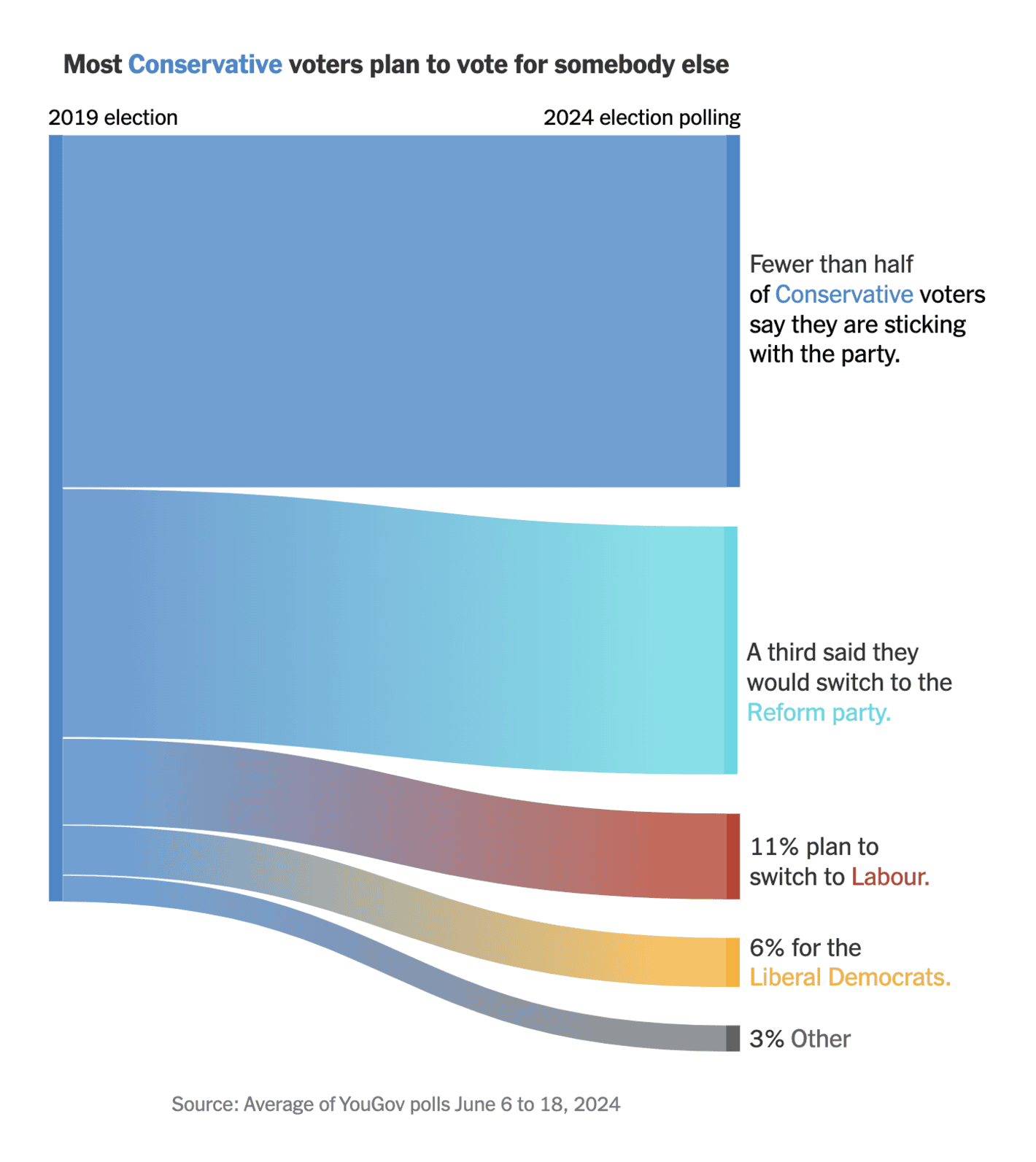
A great example of a useful Sankey diagram. In particular, it is good to provide a bit of text to each value to make it easier to interpret the movements. The only thing that I do not like about visualisations like this is that it does not show the movement of 2019 voters that planned to no longer vote. And, of course, a visualisation like this cannot alone make a story (in theory, the support for the party could be identical if other parties saw similar movements in a realignment process).
The Wall Street Journal: The Pollsters Blew It in 2020. Will They Be Wrong Again in 2024?
Another visualisation with “what if the polling error is as large in 2024 as in 2020”, but I find this one a bit more complicated to follow. Not a bad visualisation at all, but I believe there are better ways to illustrate these what if scenarios (as described above).
Climate Power: NEW: Harris Battleground Poll – Winning on Climate and Energy
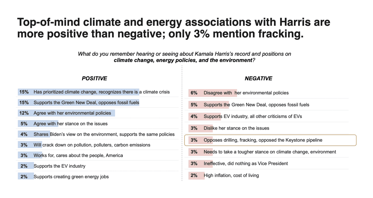
There are many different ways to visualise top-of-mind associations (e.g., word clouds), but I believe simplicity is key in these cases. This is one such example. A couple of bars and a few colours.
The Financial Times: Ishiba’s election gamble: Japan’s train-loving PM fights to keep LDP on track
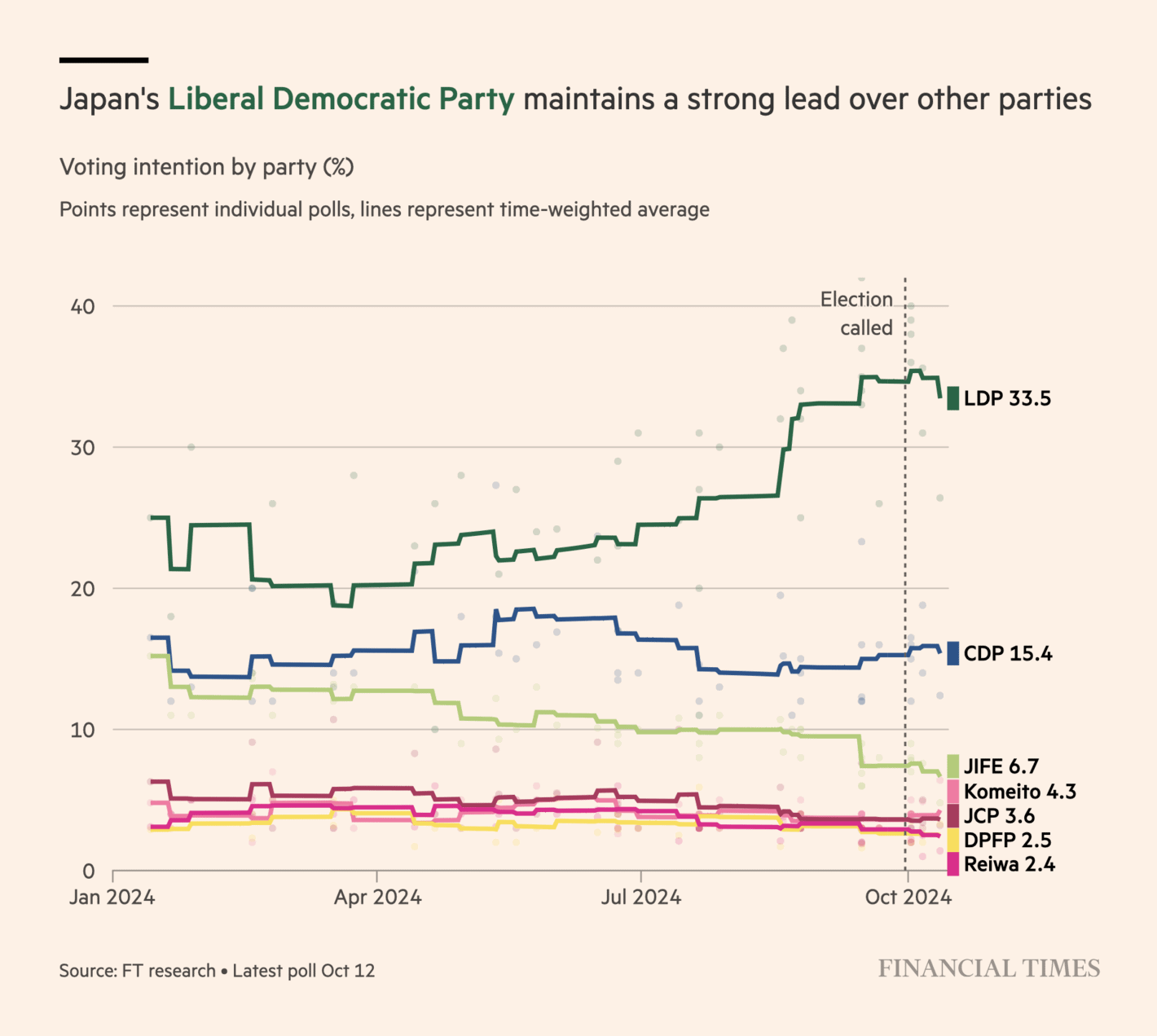
A good overview of the polls in Japan with relatively few polls (compared to elections in, say, the UK and the US). The non-smooth trend for each party is a good way to emphasise the small number of polls. I still believe they could add a bit more detail to the visualisation, and maybe even some information on uncertainty.
Silver Bulletin: Why I don’t buy 538’s new election model
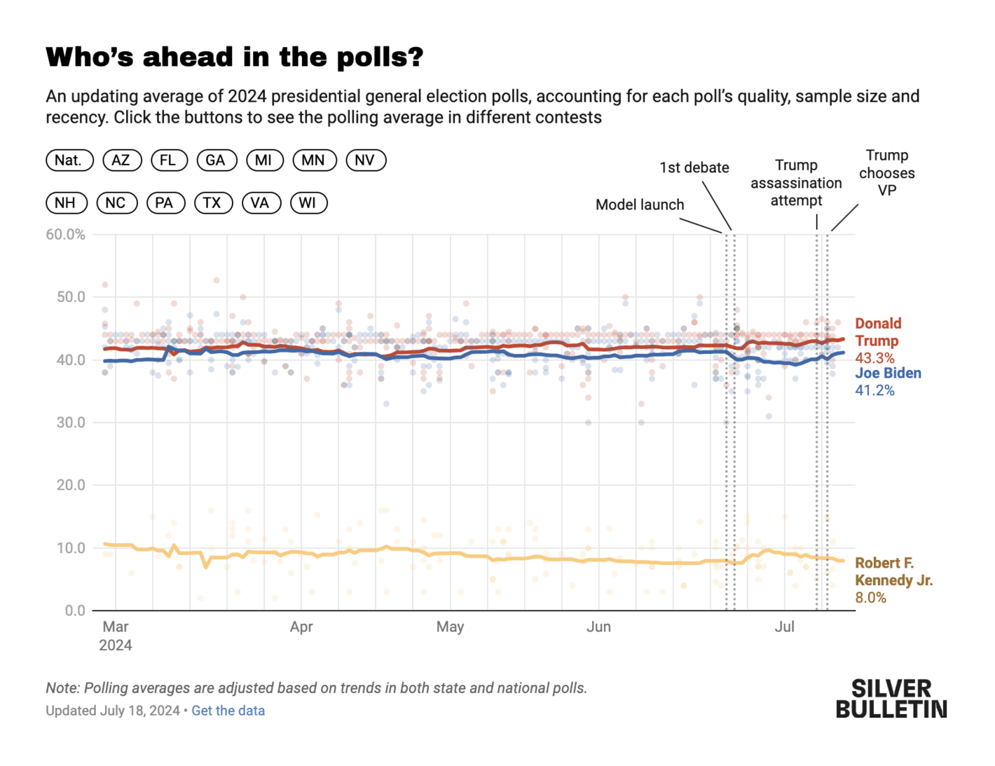
The poll of polls by Nate Silver. This is a simple but effective way of showing the numbers (though I am not sure 8.0% to RFK Jr. made sense at any time in the campaign, but that is beyond the scope of this assessment). The visualisation is doing a good job at showing the stability of the polls in the context of significant events (such as the assassination attempt on Trump), but I am not sure it adds a lot of info to also highlight when the model was launched. It is also a good feature to make it easy to explore the average in different states of importance.
FiveThirtyEight: Who Is Favored To Win The 2024 Presidential Election?
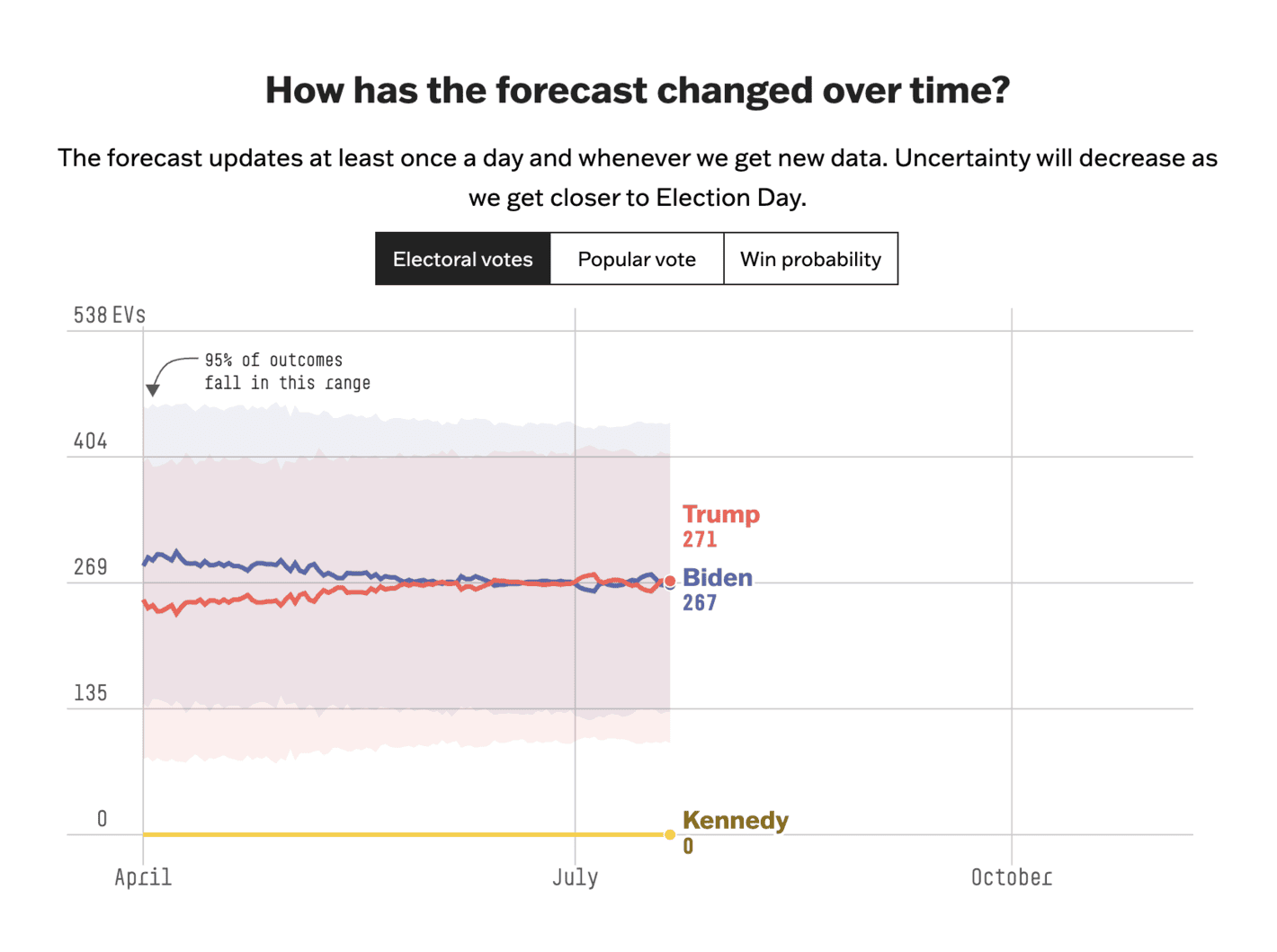
The good thing about this visualisation is the focus on uncertainty with a description of how to interpret said uncertainty. That being said, I am not sure what to make of this model (see, e.g., the discussion by Nate Silver in the link in the visualisation discussed above). I would also have liked to see some visualisation of the individual polls within this visualisation.
La Nación: Harris vs. Trump – Qué pronostican las encuestas
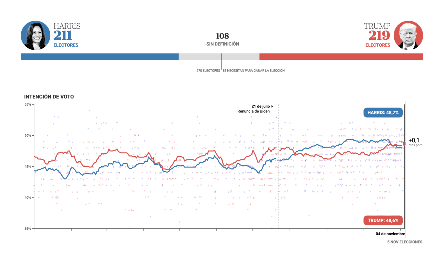
This one is in Spanish so I will not evaluate the text or labels used here. It is a very generic presentation of the polls and I would have liked to see a few more details and some model uncertainty (do you see a pattern here?).
YouGov: Votivation: are Britons voting for the party they like most, or against one they dislike?
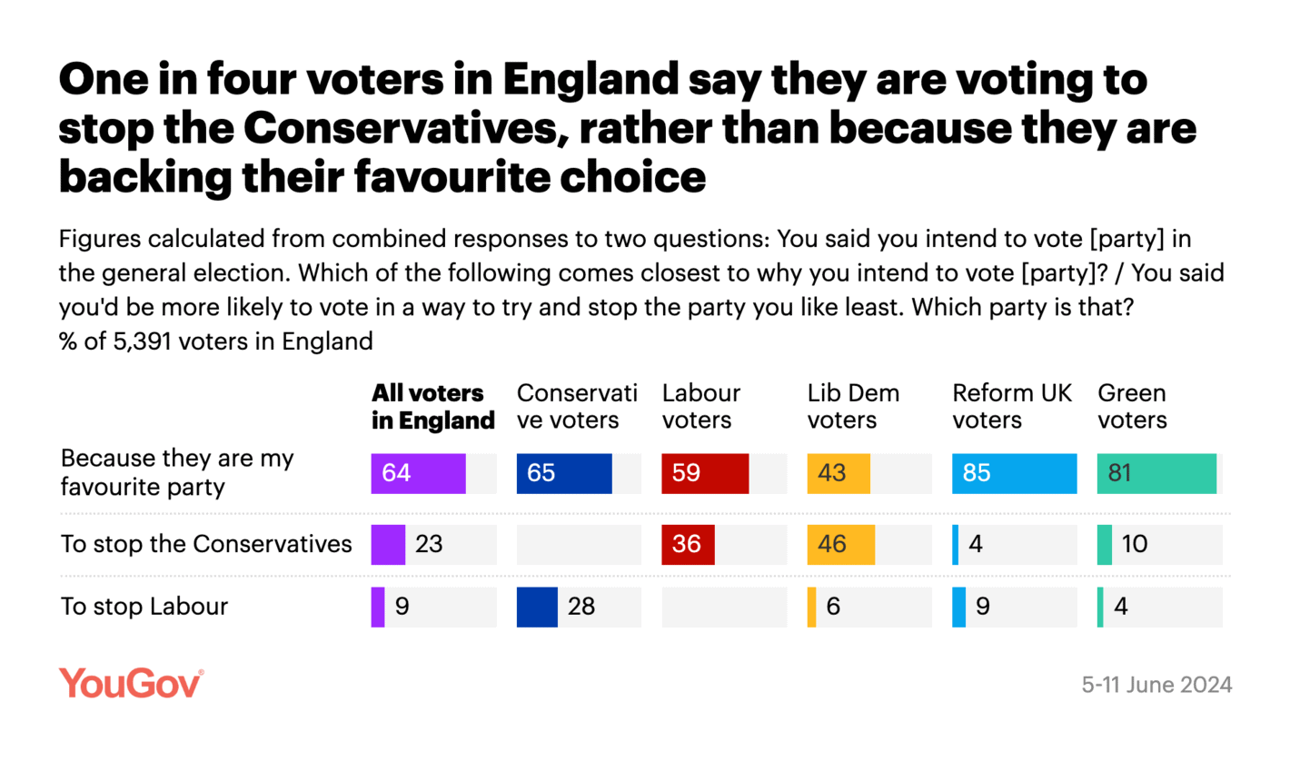
Another good visualisation from YouGov. What I like about this visualisation is that it contains a lot of information (together with an interpretation of what the data shows). This is ideal for sharing on social media without having to look up additional details (such as question wording and fieldwork dates).
The Financial Times: Five takeaways from France’s election
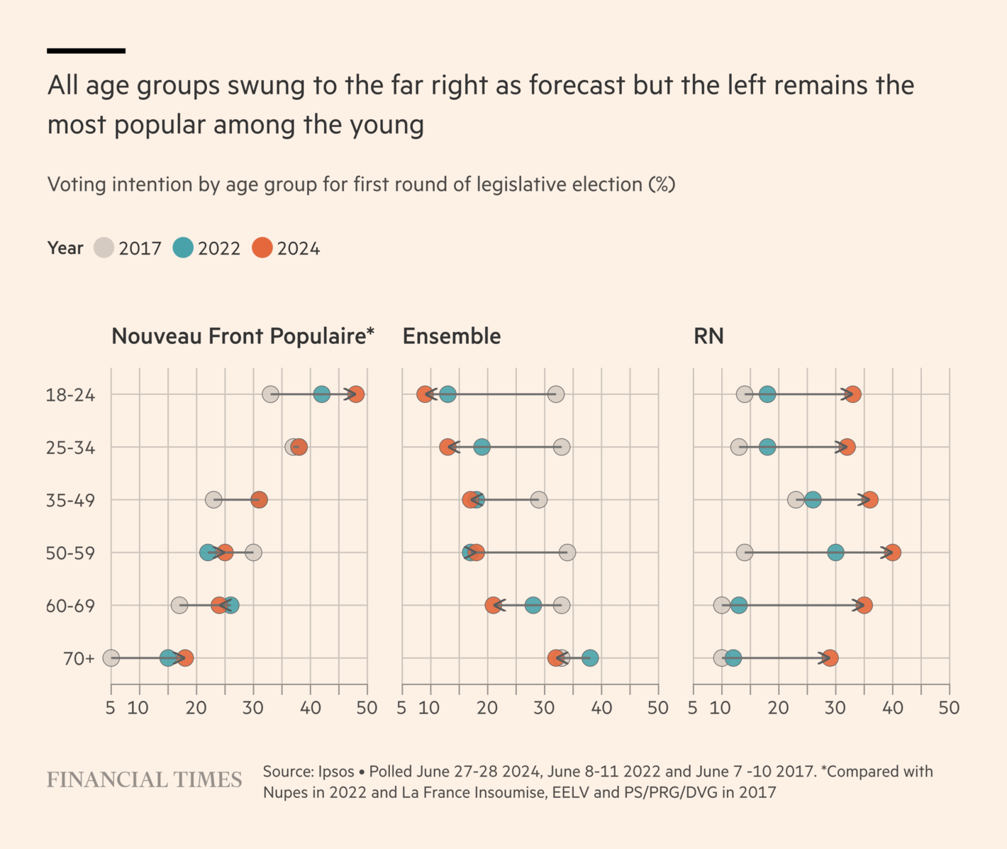
This is an interesting way to visualise data over time. I understand why the data is being visualised like this (there are a lot of numbers), but I am convinced there is a better way to communicate the key point (preferably some time series plots where only the trends of interest are highlighted). It is also weird how some estimates are not shown for NFP in 2022.
The Times: How well off are British pensioners by international standards?
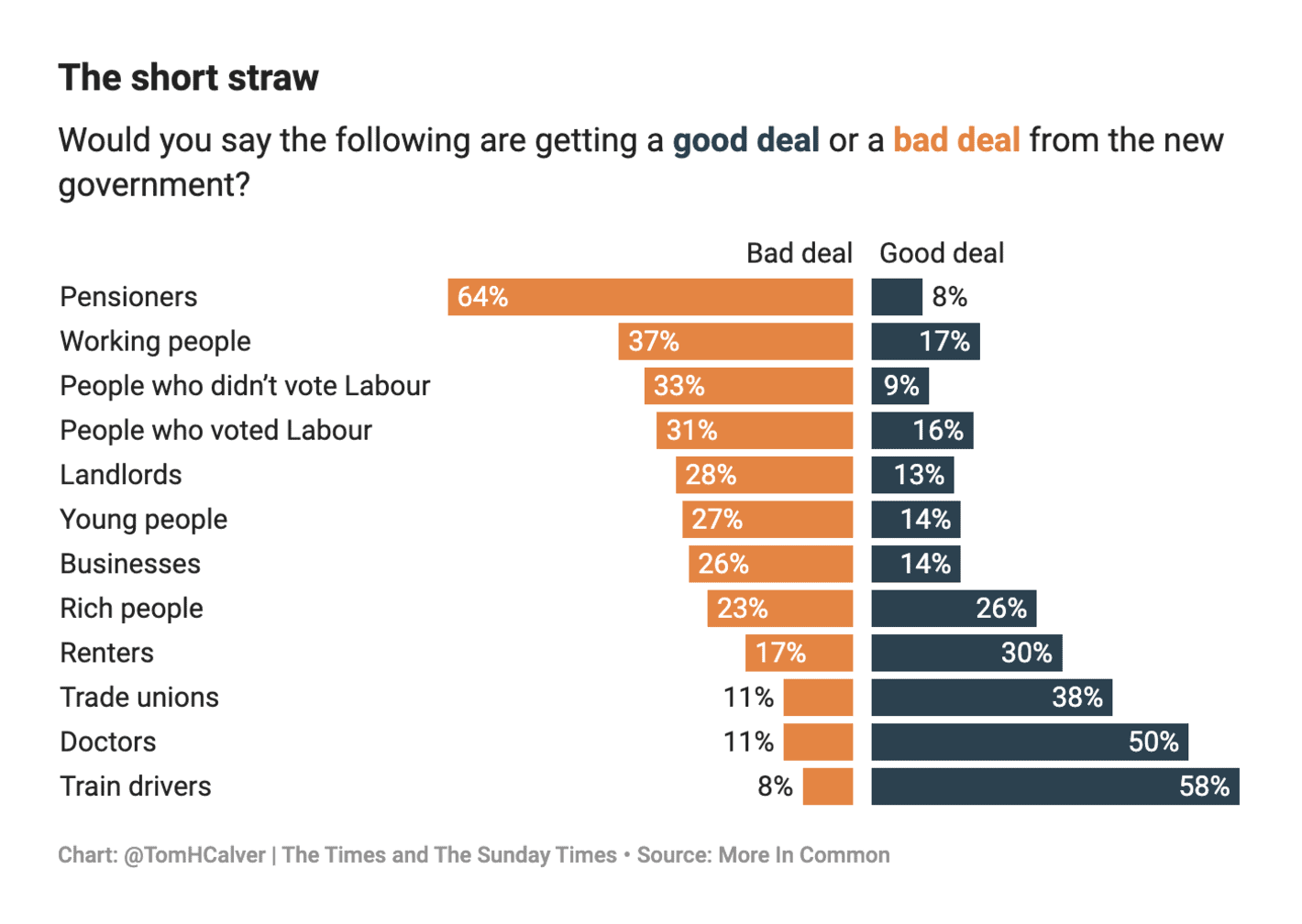
A simple and effective bar chart. I would have liked to see a bit more work going into this visualisation (e.g., some icons next to the labels). It could also be interesting to see comparisons with some actual policy proposals (i.e., to see whether there is an alignment between public attitudes and policy).
The Financial Times: Trump broke the Democrats’ thermostat
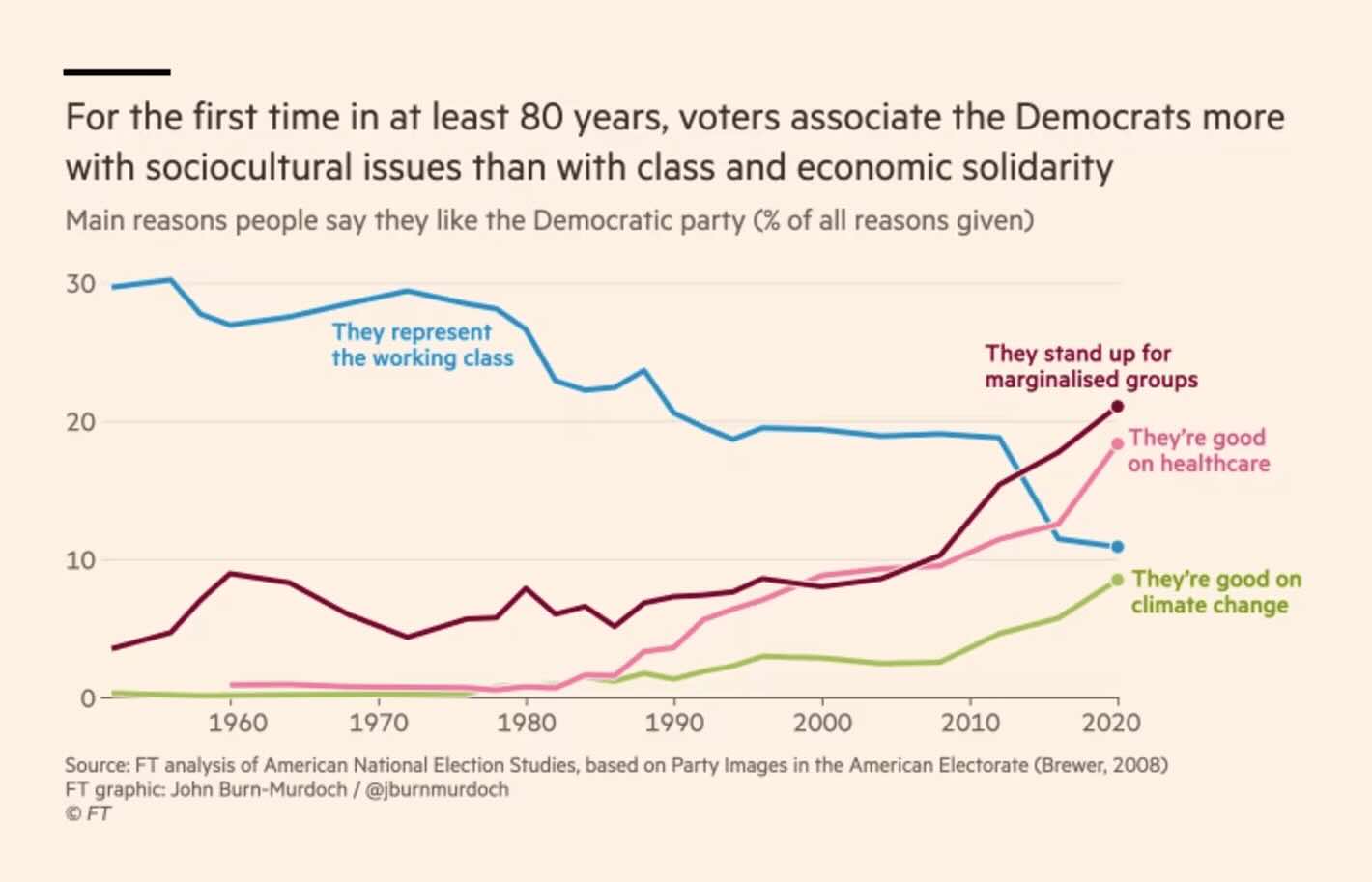
Direct labels, only a few lines, etc. In other words, a good visualisation. That being said, I am not sure the conclusion in the visualisation automatically follows from the plotted data. What are the lines not being shown? And maybe standing up for marginalised groups can also indicate economic solidarity?
YouGov: How early risers, gossip-spreaders, UFO-seers and more lean in the presidential election
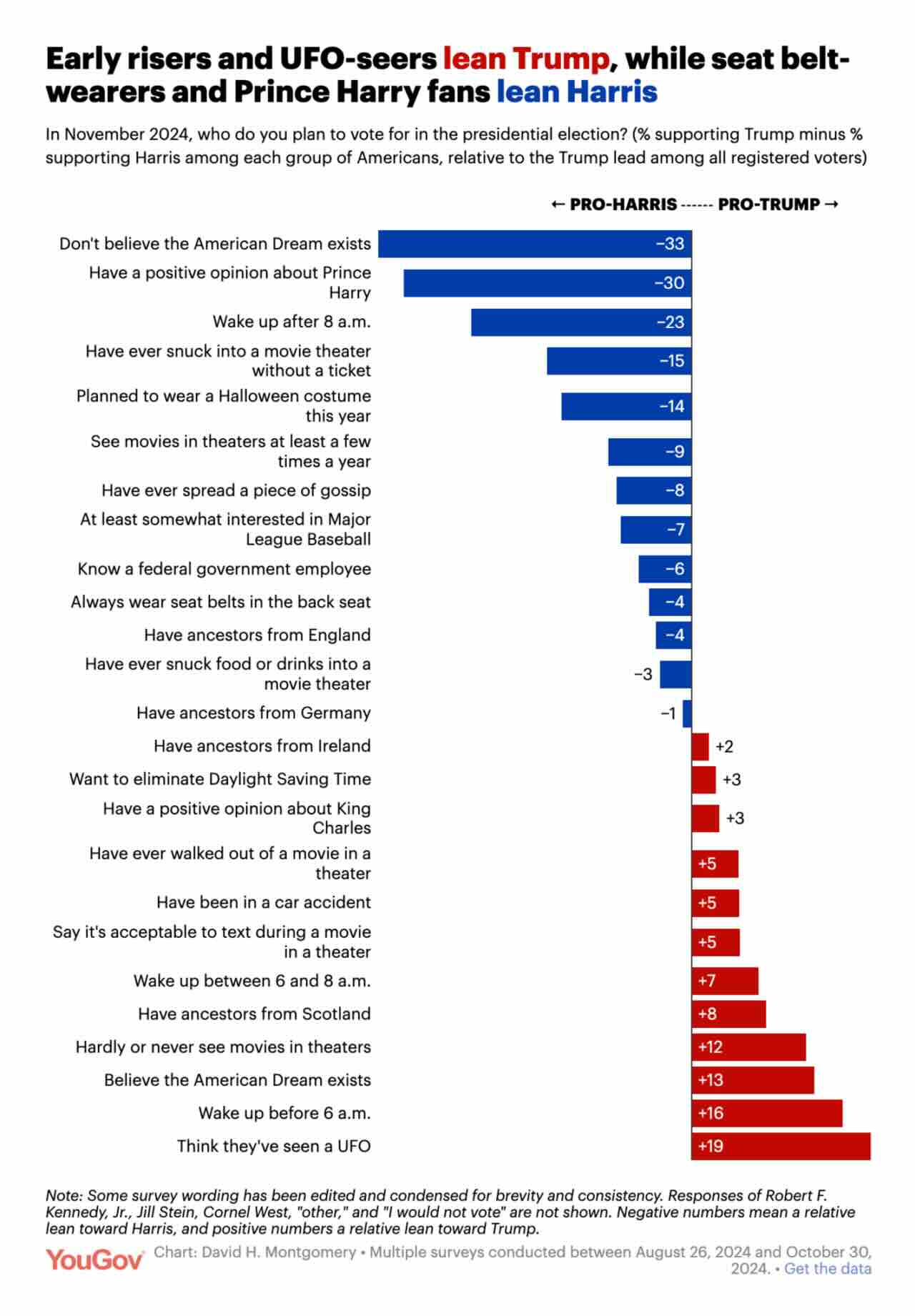
A visualisation of the various correlates of support for Harris and Trump. I do not like these types of “kitchen sink” visualisations. I can imagine that the treatment of don’t knows for some of these items will also matter a lot. But as a bar chart visualisation of data I guess it is OK.
The Guardian: Labour are ahead in the polls, but have they won hearts and minds? These charts suggest not
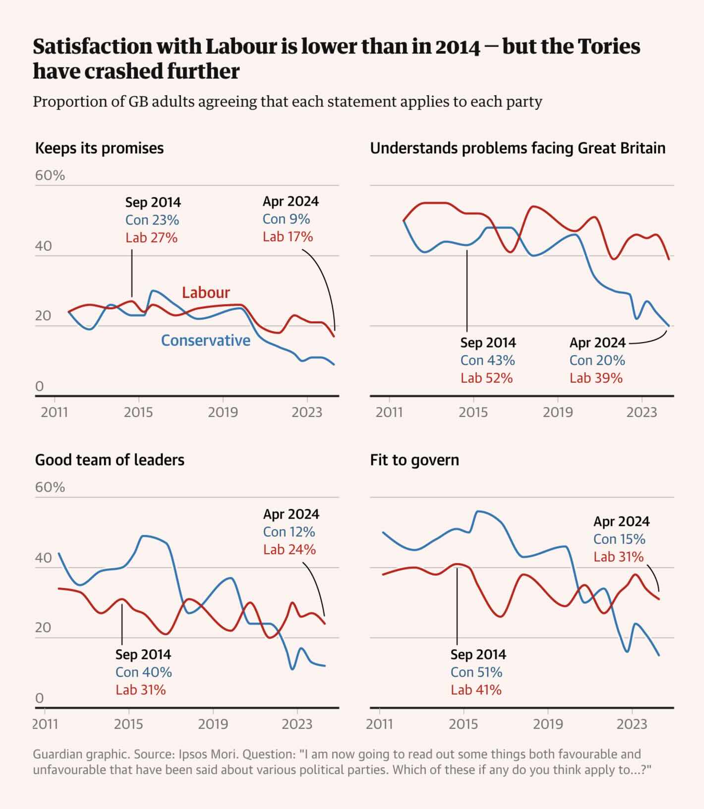
The movement in these figures over time makes it difficult to easily evaluate the trends in the data. I would have preferred plotting individual dots of the polls and maybe connect them with a trend line.
The New York Times: This Time, It May Actually Come Down to Turnout
Not a bad visualisation per se but we are here looking at data on not only turnout but also for specific subgroups. The rule should be that you cannot do that unless you also convey the margin of error and the exact sample sizes for the different groups. Sure, the information might be available in a methodological appendix somewhere, but that is not the point here. Other than that, fine.
The New York Times: 17% of Voters Blame Biden for the End of Roe
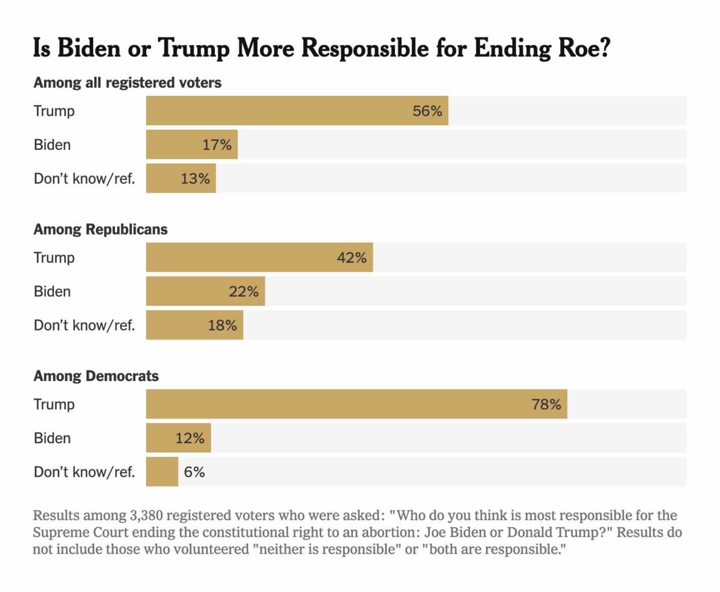
A simple bar chart but I find this one too simple. The reason is that specific answers are excluded, and especially among Republicans it could be relevant to know whether people believe that neither is responsible or both are responsible.
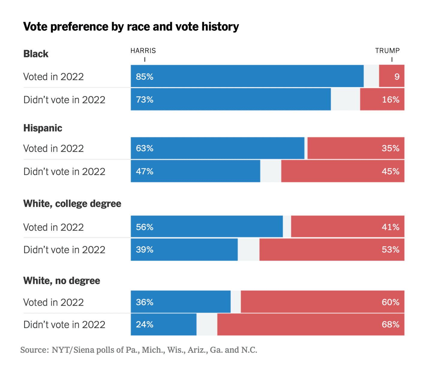
Split Ticket: We Polled Black Voters. Here’s What We Found
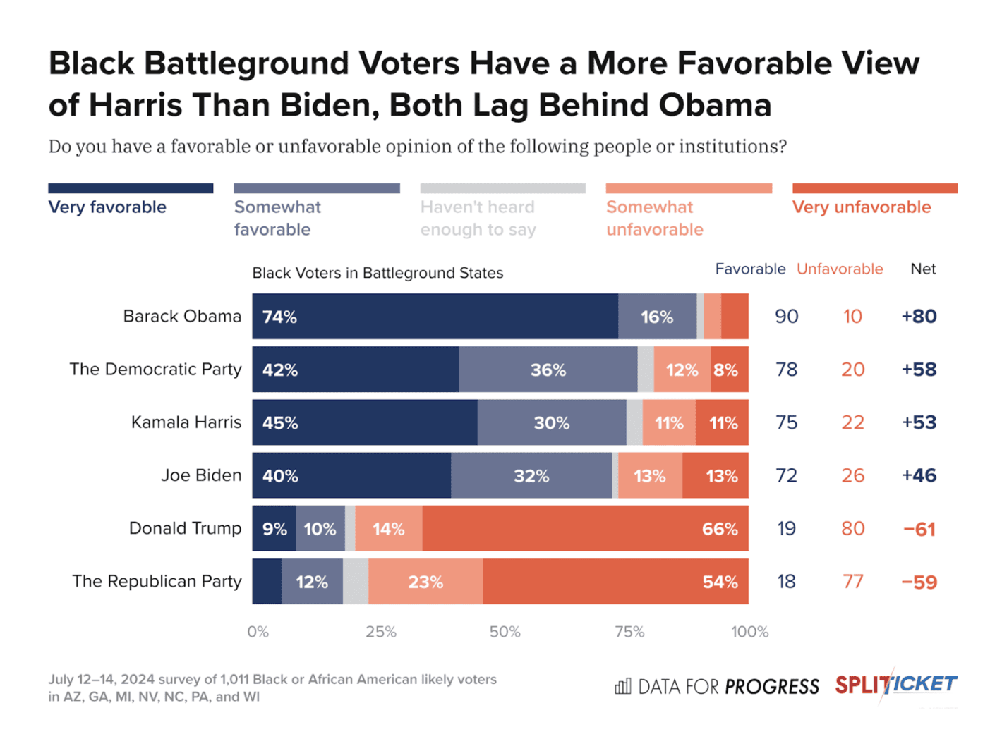
This is a good overview with a lot of numbers, making it easy to get the key insights from the data. We see some of the limitations here as mentioned previously, most importantly of course no details on the margin of error (especially if don’t knows are not included).
YouGov: Political tracker roundup: April 2024
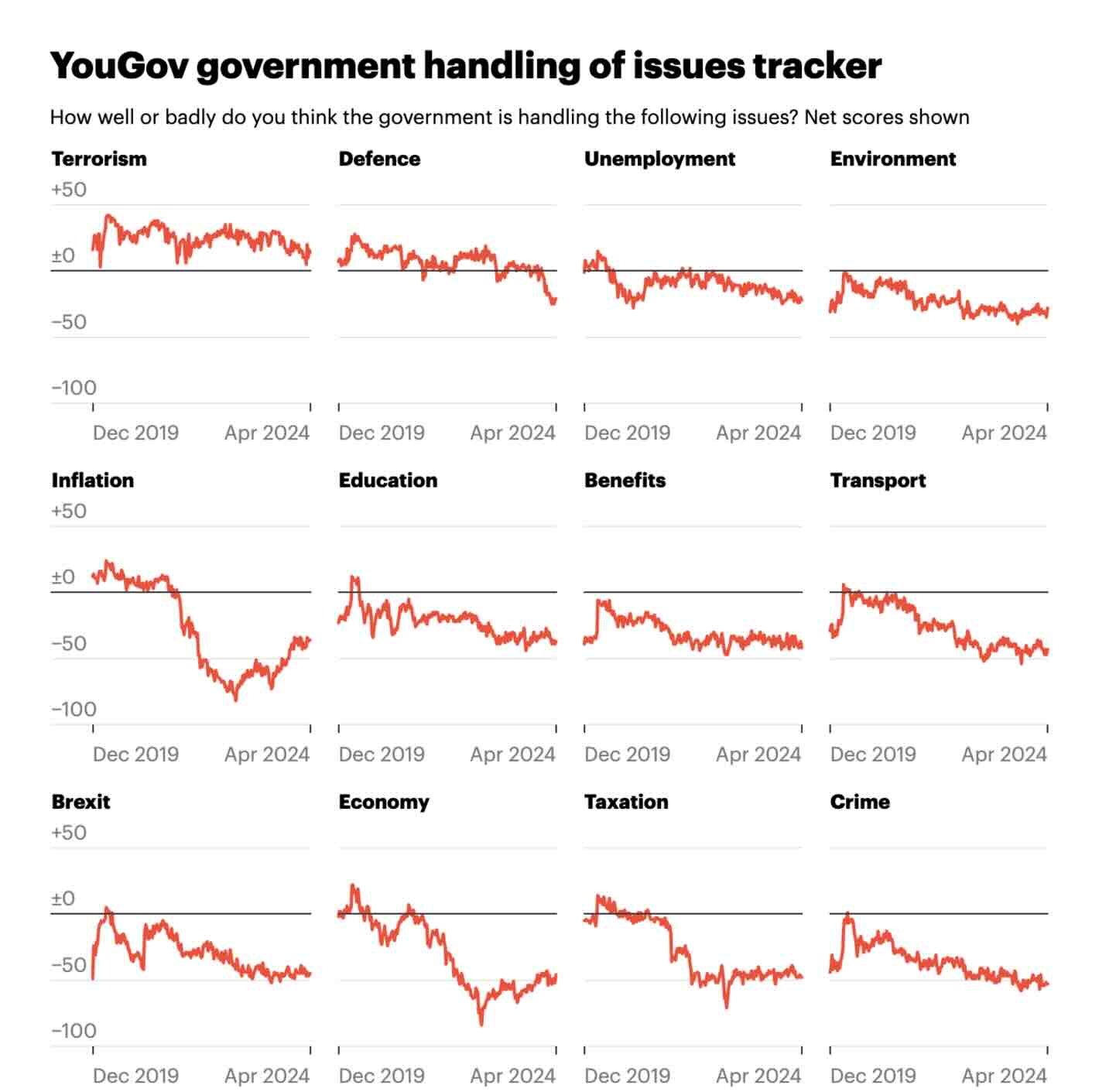
A good and simple visualisation of how the government is performing across several issues over time. Nothing fancy, but good for what it is.
The Financial Times: Why did the pollsters overestimate Labour’s vote?
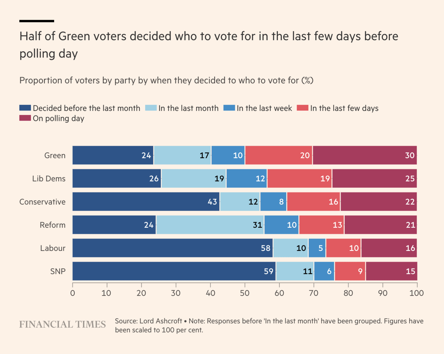
The idea behind this visualisation is good but I am not a fan. You have very few voters for some of these parties in your sample and I am not sure such a visualisation can help you understand anything related to polling errors. For example, if a lot of Conservative voters decided to leave the party the day before the election, that would make it look like supporters of other parties decided in the final few days. In other words, while it can be interesting to look into when voters decide on a party to vote for, the party split is not necessarily informative, and accordingly, this visualisation is a bit confusing on its own.
The Wall Street Journal: Arizona Is Booming, but Restless Voters Feel Downbeat About Economy
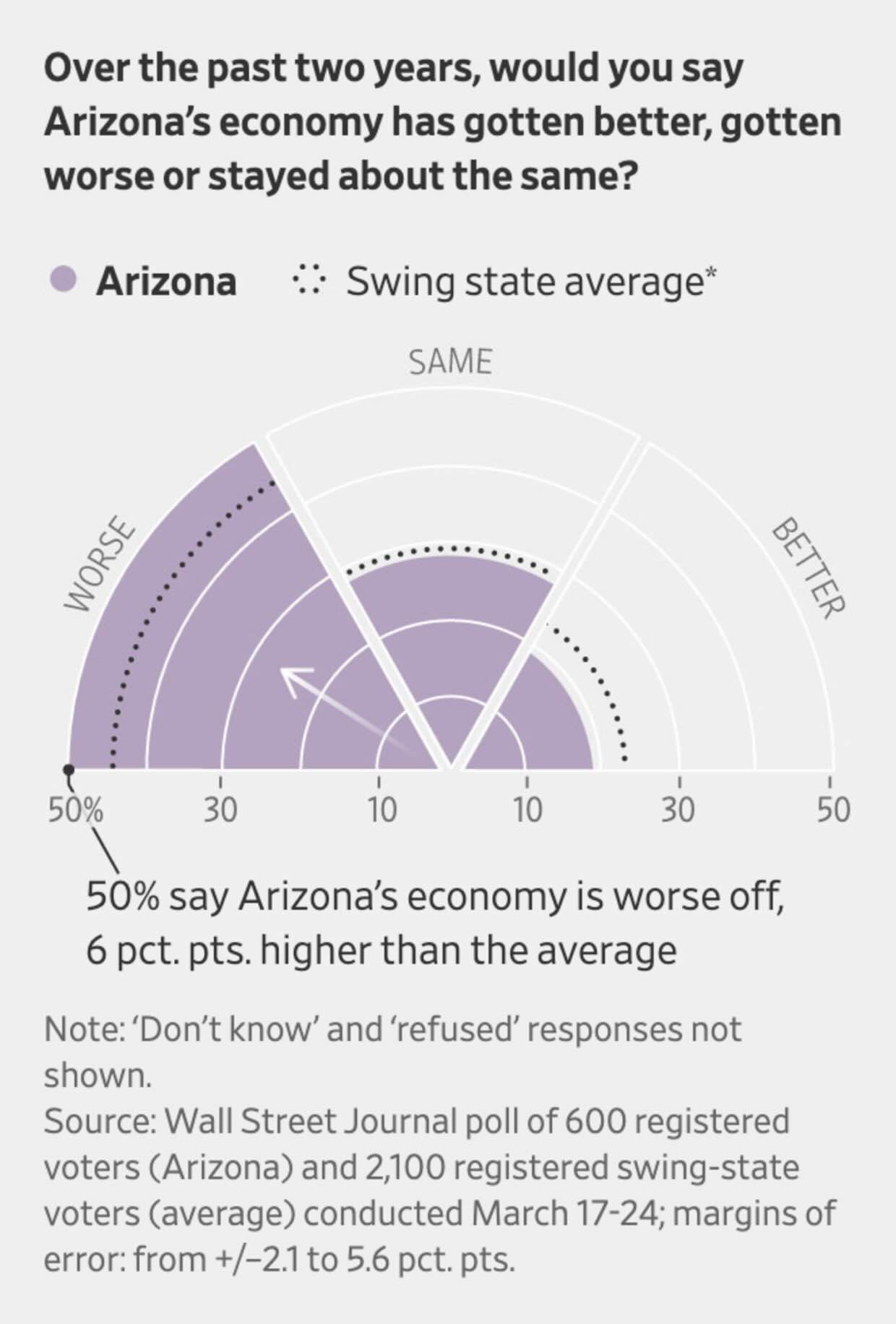
This is a creative way to show the data but it is not the best way to show the data. The particular choice of visualisation makes it difficult to show the margin of error (hence, it is only communicated in the note to the visualisation). It is also difficult to compare the different bars. A simple bar graph would have done a much better job here.
Bloomberg: Mexico Election 2024: Polling Tracker
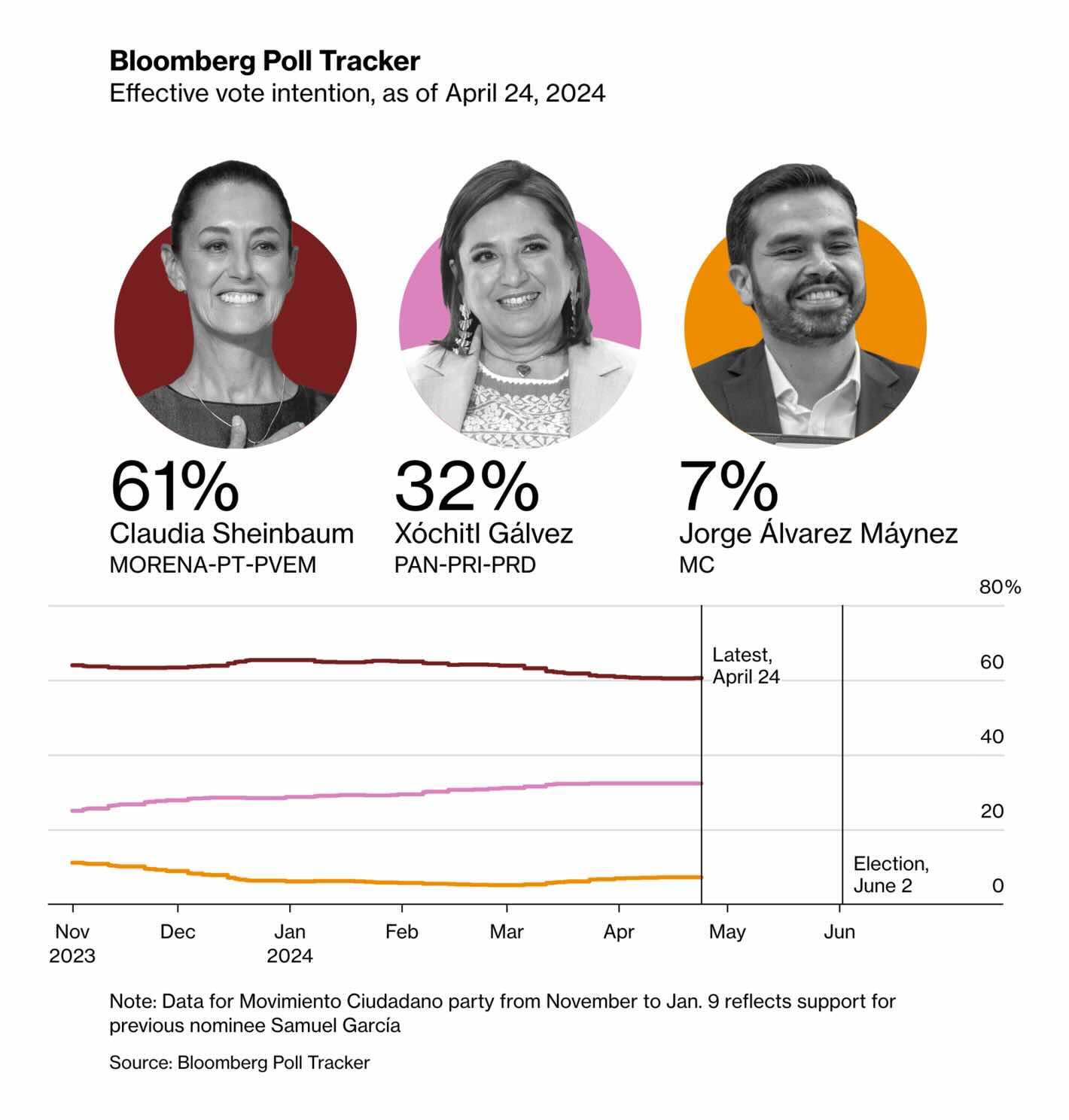
Why only show a few lines without any individual polls, model uncertainty, etc.? A lot of things to be desired here. And given the fact that the estimates for the three candidates differ substantially, why not plot the numbers next to the lines?
The Financial Times: The left is losing its grip on ethnic minority voters
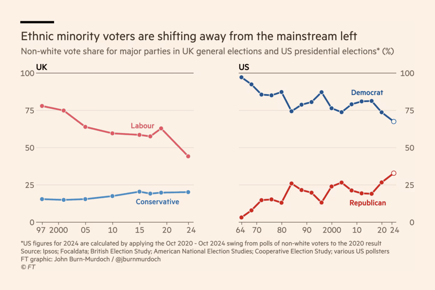
There is a lot going on in this visualisation despite the fact that we are only seeing a few lines (e.g., look at all the different data sources in the note). It is one of those visualisations where visualising uncertainty is even more important than usual (again, especially when you focus on data with smaller groups). In the United States, for example, I am confident that there is no difference from 2024 compared to the early 2000s.
The Economist: Which way will swing voters lean in America’s election?
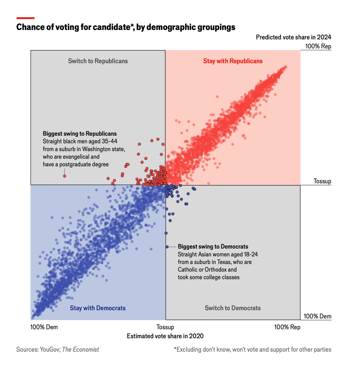
An alternative way to visualise vote swings. I find this visualisation difficult to understand without reading the details and engaging with the context of the visualisation. The visualisation puts too much emphasis on individual dots and I would like to see some additional grouping to focus on the robust patterns and trends rather than a few small groups.
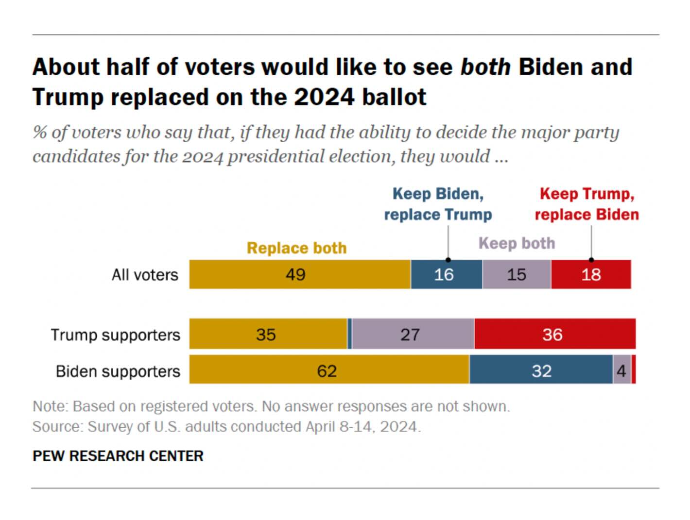
Pew Research: In Tight Presidential Race, Voters Are Broadly Critical of Both Biden and Trump
A typical visualisation by Pew Research (and I mean this in a good way). I would have liked to see the ‘Keep both’ either next to ‘Replace both’ or all the way to the right, but that is a minor point. Overall, a good visualisation but nothing extraordinary.
The Wall Street Journal: America’s New Political War Pits Young Men Against Young Women
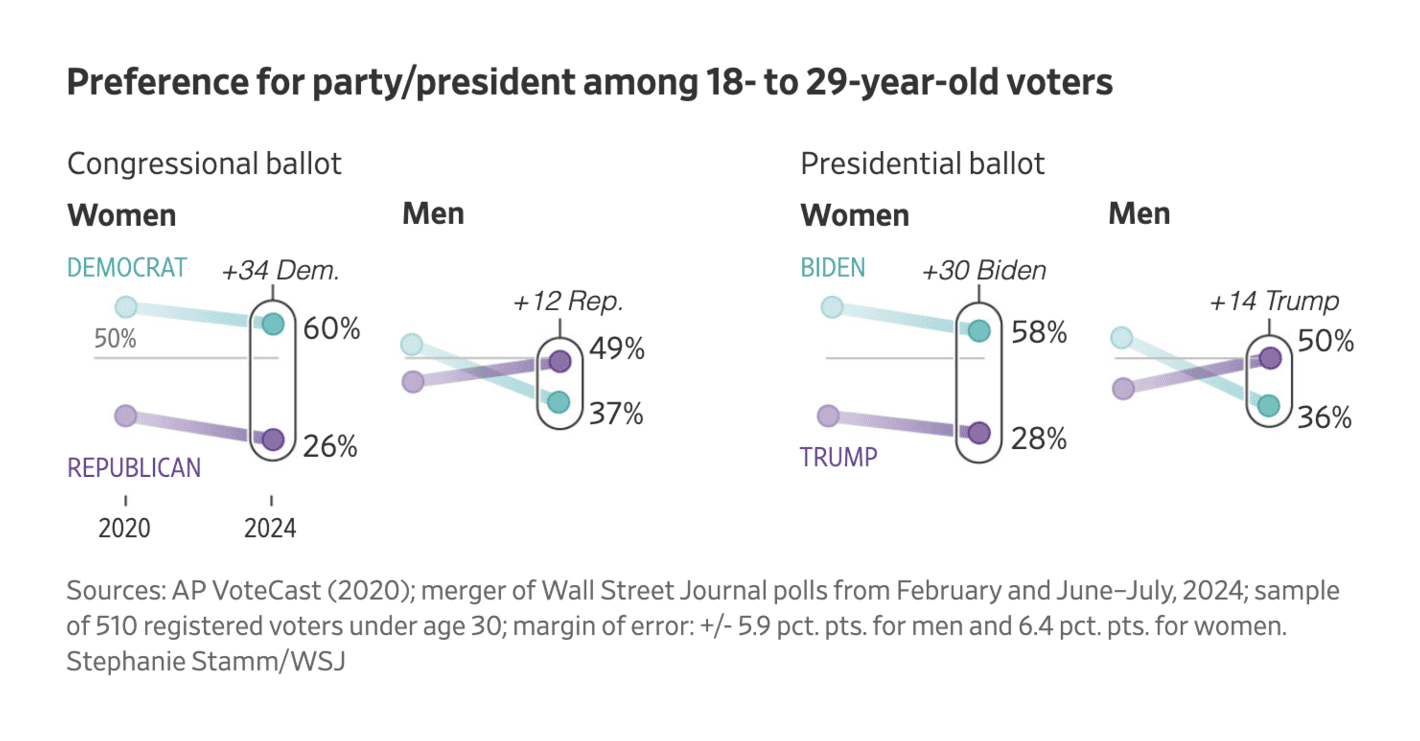
This visualisation is a bit too minimalistic for my taste. There is only a single value on the y-axis making it difficult to easily get a sense of how big the differences are. Also, while the margin of error is reported in the footnote, I would appreciate it to be part of the visualisation itself.
The Financial Times: Kamala Harris draws level with Donald Trump in race for the White House
Not a bad visualisation but it can be difficult to interpret the numbers here. How many voters are we talking in the specific groups? And if we consider self-reporting turnout and other limitations, I am not sure there is a lot of interesting material to get out of this visualisation. In other words, too many numbers and some unlikely assumptions that should hold for these numbers to be of any interest.
The Wall Street Journal: Race Is On to Reach the Rapidly Shrinking Pool of Undecided Voters
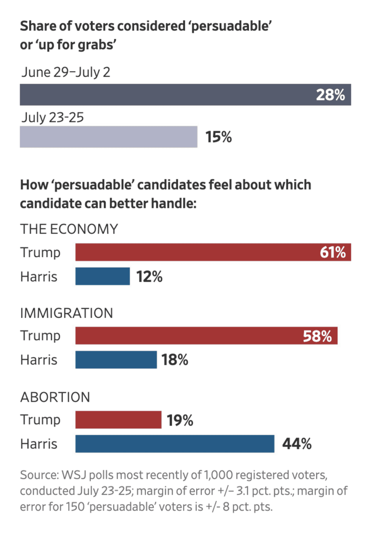
The devil is in the detail. The margin of error is +/- 8 percentage points for the persuadable voters. When the different numbers in a visualisation rely on different sample sizes, I prefer that to be visible beyond the information in a footnote (some confidence intervals would be a sensible start).
The Financial Times: How the Conservatives came to the brink of wipeout
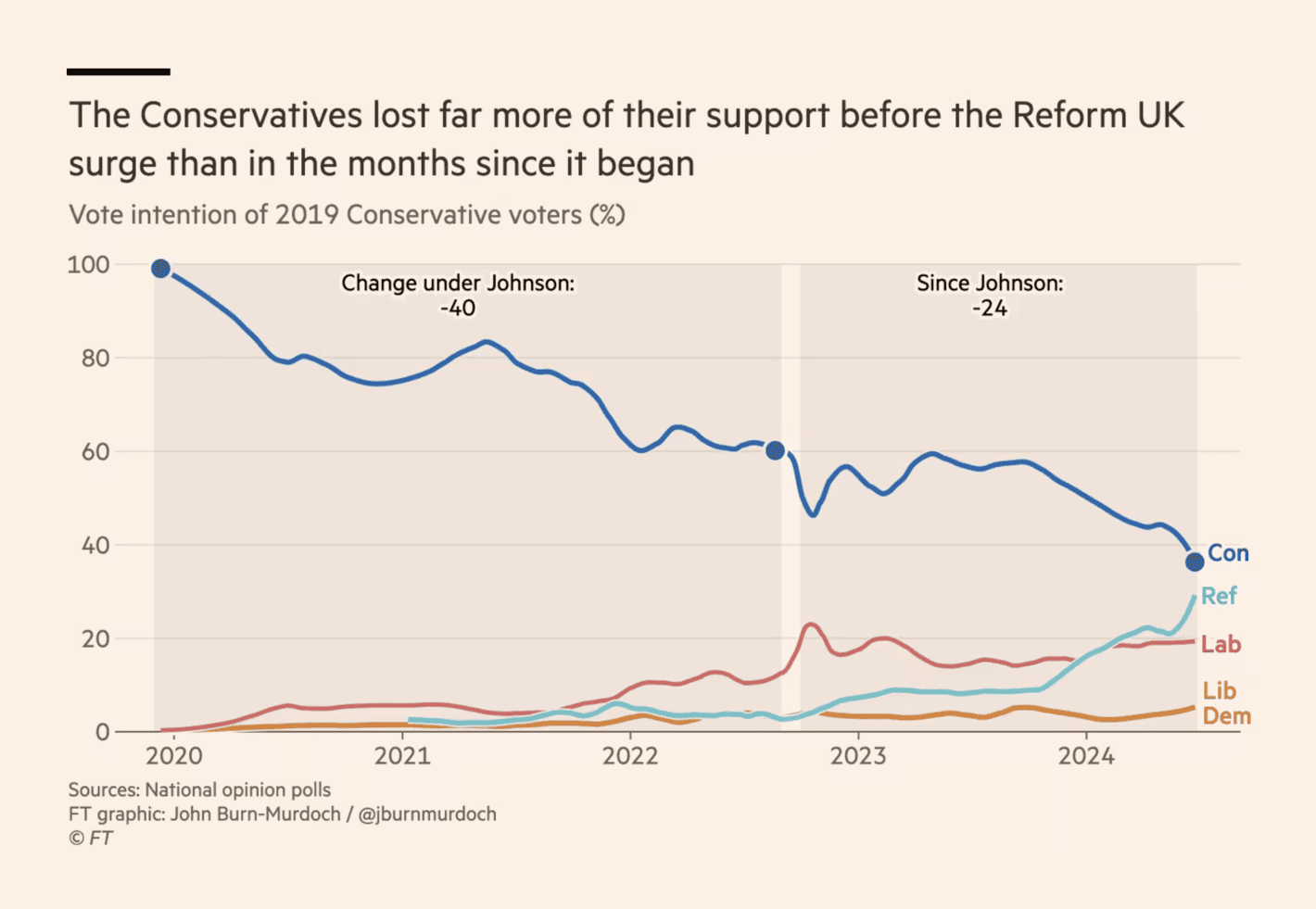
The data looks too smooth for my liking in this data visualisation, especially when you take into account that it is an analysis of a subgroup of voters (i.e., 2019 Conservative voters). As pollsters have different methods to get at these voters (e.g., some pollsters using vote recall, others using panel data with validated 2019 vote), I believe this visualisation is a bit too clean. There might be an interesting story here, but as a data visualisation on its own, I am not a fan.
Der Spiegel: So steht es im Rennen ums Weiße Haus
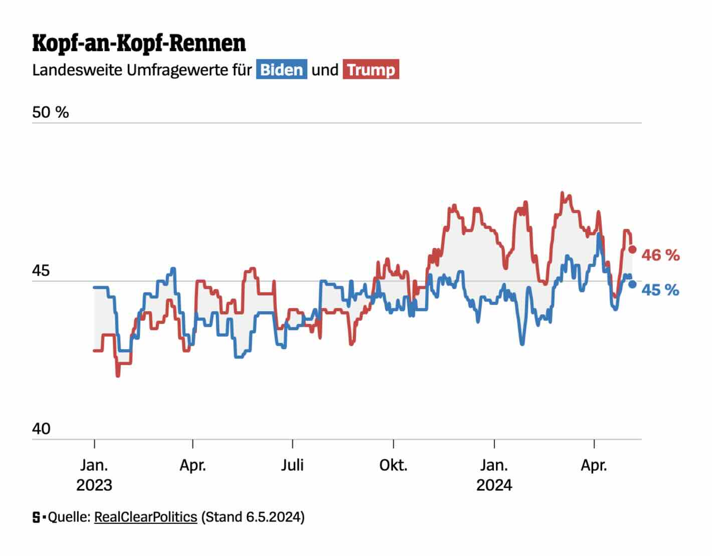
One of the worse visualisations of support for Biden and Trump over time. Too much variation, too little focus on trends and the data going into the estimates (e.g., individual polls). The gray area between the two lines is an interesting idea, but why not give it a colour shaped by what line is above the other (i.e., which candidate is ahead)?
South China Morning Post: Rise of Asian-American voters in US elections
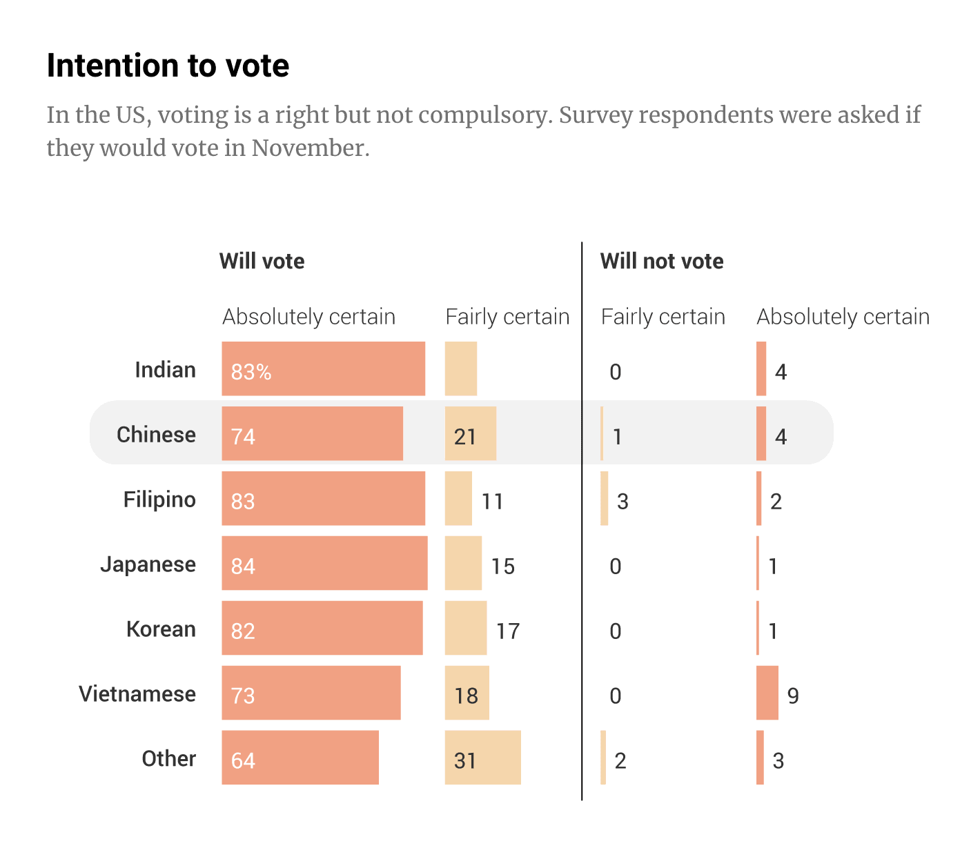
A lot of bars in this visualisation and difficult to infer the main point (if there is any). Maybe it should have a better title than “Intention to vote”? Or maybe it is just the inherent limitations of using self-reported intention to vote data that makes me less interested in this visualisation overall? In any case, I am not convinced this is the best way to visualise this data.
The Financial Times: Brace for the most distorted election result in British history
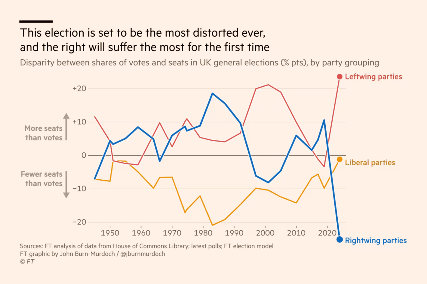
It is not easy to transform polls into seats based upon national polls in a FPTP voting system, and any visualisation trying to show the discrepancy between votes and seats should at least try to convey some notion of uncertainty. That being said, what I primarily do not like about this visualisation is how specific dataviz gimmicks are used to emphasise the difference (e.g., letting the numbers go below the x-axis values).
The Wall Street Journal: Battle for Swing States Is Tied, Trump Has Edge on Top Issues, WSJ Poll Shows
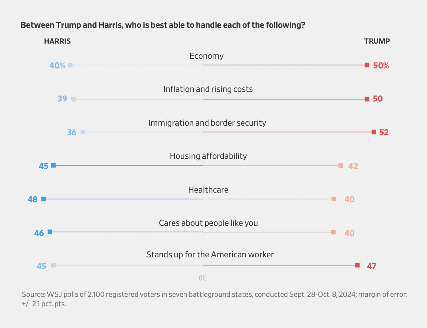
I do get the idea with this figure. That is, use the colours to emphasise whether voters believe Trump or Harris are better at dealing with particular issues.
However, I do see a few problems with this type of visualisation. First, I am not sure there is any logic to the order of the issues, and I would prefer an order that made it easier to compare the differences between the candidates. Second, related to the comparison, with the bars going in different directions (Harris to the left, Trump to the right), it is difficult to compare the bars without looking at the exact numbers for each issue. Third, the visualisation puts too much emphasis on the differences by having a “winner” for each issue. What would happen if we were to take the margin of error into account, or if the numbers for Harris and Trump were the exact same?
Accordingly, I would prefer a simple bar chart with the numbers next to each other (and confidence intervals), sorted by gap between the two candidates on the different issues.
The Wall Street Journal: Why Democrats Keep Losing the Battle for Small-Town America
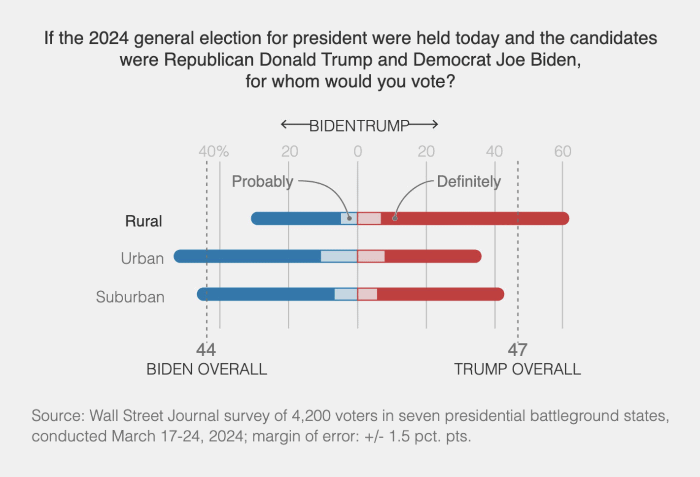
You can visualise the support to political candidates in multiple different ways, but this one is not one of my favourite ways. The bars are difficult to compare and it takes more mental energy than should be required to understand the urban-rural divide in the support for Trump. In addition, there are small aesthetic issues such as the x-axis label looking like it says BIDENTRUMP.
Washington Post: See how people like you vote and how that’s changed over time
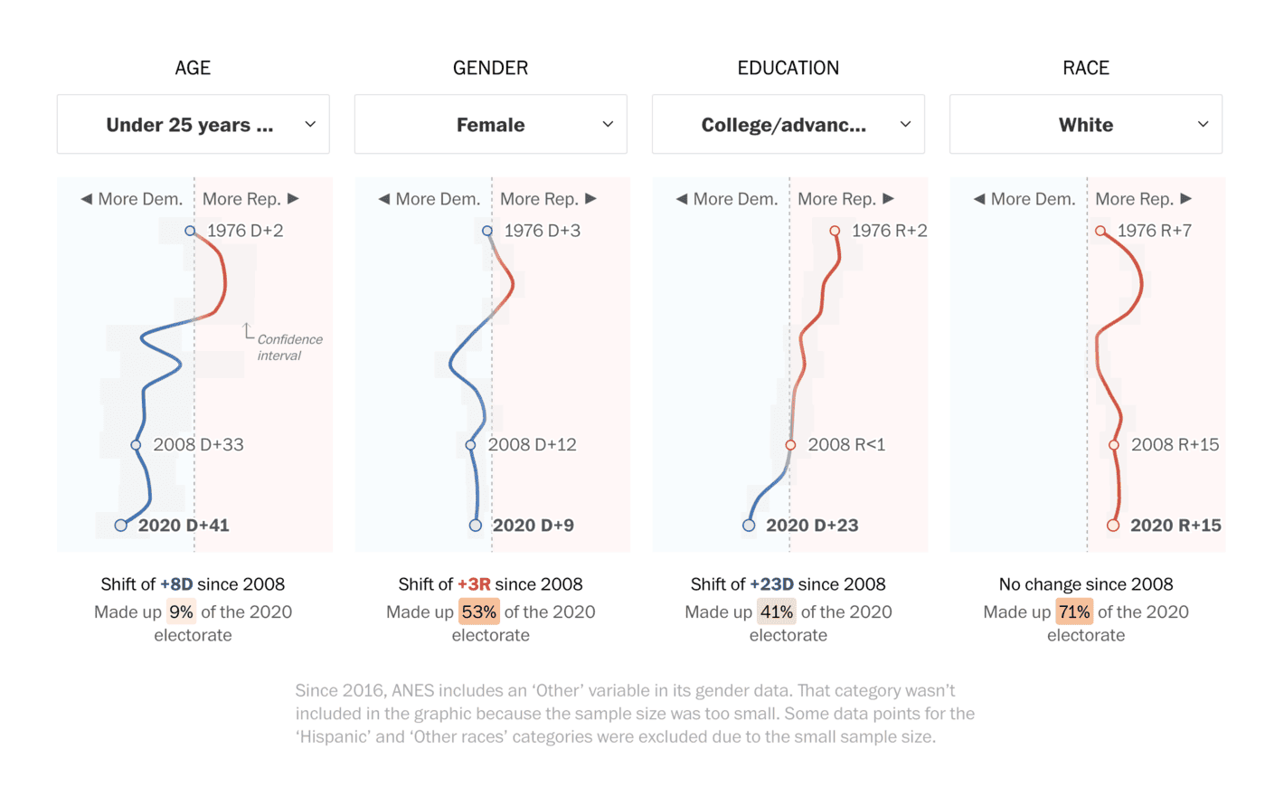
This is not necessarily a bad visualisation but I always find it confusing to have time on the y-axis. It is difficult to compare different lines over time and I see a lot of low-hanging fruits in making this visualisation more informative and easier to interpret. It is great that they have plotted confidence intervals as well, but they are a bit too easy to miss.
South China Morning Post: Tracking the polls in the 2024 US race
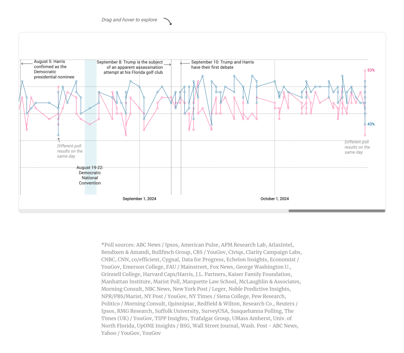
Do not try to do connect-the-dots on a series of different polls, especially (but not limited to) when you have polls from different pollsters. There is simply too much noise in this visualisation.
So, here we are. Ranking all of these visualisations was a lot more difficult than I initially had imagined. The reason is that the quality overall is good, and what makes one visualisation better than others? I would say that 20% of the visualisations are very good, 10% are bad, and 70% are good. The ranking of these ~70% is not random, but it might as well have been.