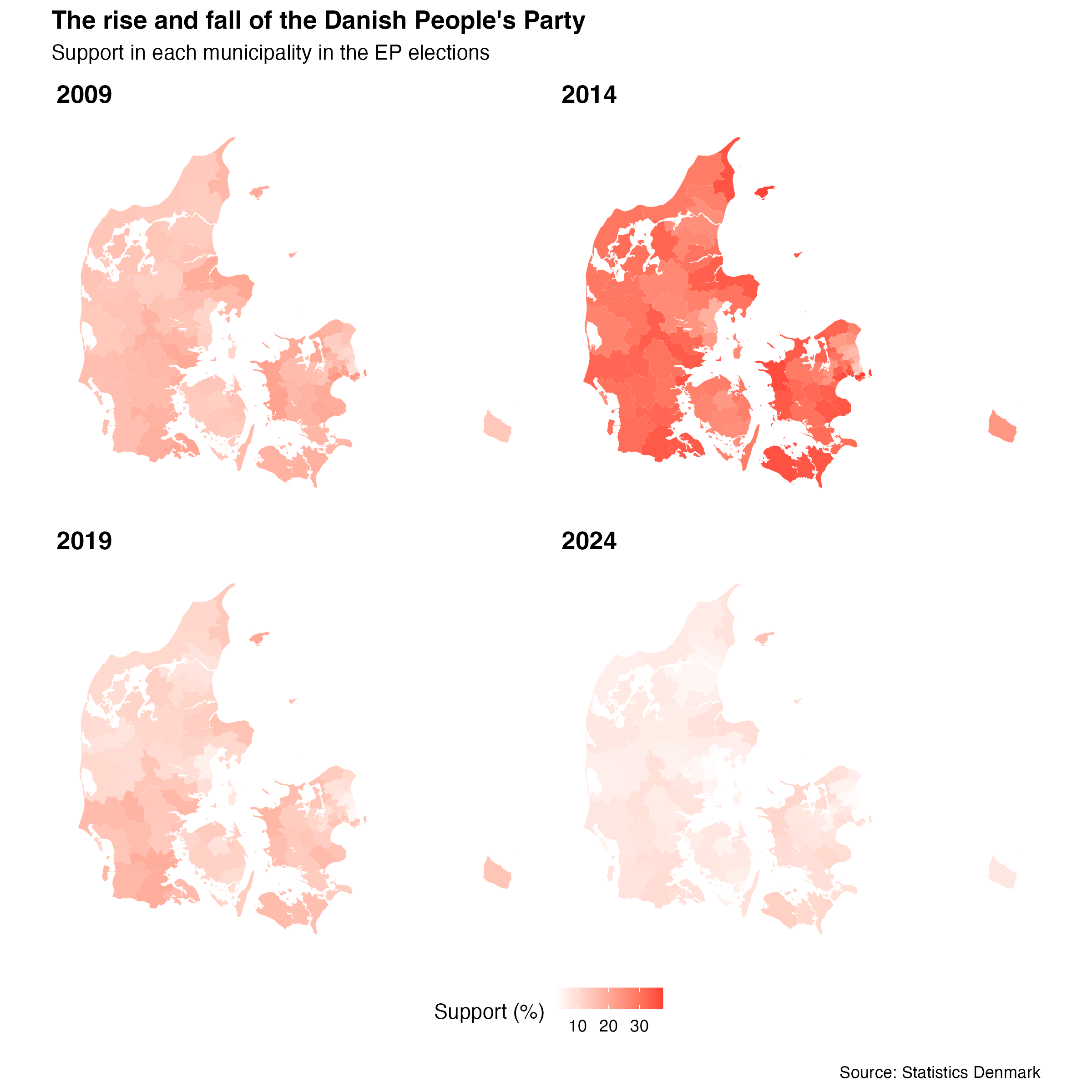
In 2014, the Danish People’s Party achieved a great result in the European Parliament election in Denmark. They became the biggest party with 26.61% of the votes. Ten years later, in 2024, the party only got 6.37%.
Here I will show how to create a figure showing the local results of the EP election in Denmark for the Danish People’s Party (at the level of municipalities) in R. I will use the package {danstat} to get the data into R (check out the vignette for an introduction on how to use the package). We will, unsurprisingly, be using {ggplot2}.
The setup will not require that you download any data and import CSV files or the like. Instead, we will use a few packages (that are all available on CRAN), to access the data and create a figure. This is not necessarily the best or easiest way to do it, but hopefully it can be of interest to people working with data from Statistics Denmark (Danmarks Statistik) or plot data in R at the level of Danish municipalities.
Here are the four packages we will use (most noteworthy, we will not use a lot of tidyverse packages for the data wrangling):
library("danstat")
library("ggplot2")
library("plotDK")
library("patchwork")
library("purrr")
The first thing we need to get is the metadata of the dataset we would like to use from Statistics Denmark. For that purpose, we rely on the function get_table_metadata(). In brief, this function provides information on all the variables of interest for a specific type of data provided by Statistics Denmark. The data of interest here is the election results from the EP elections, which has the ID “EVPANDEL”.
evp_metadata <- get_table_metadata(table_id = "EVPANDEL",
                                   variables_only = TRUE)
To make it easy to get the data, we next get the relevant code-value pairs, which will provide us with a list with elements for each of the variables we will get data on (such as the location, the year and the vote share of the individual parties). We rely on map2() for this, primarily because that is what is being used in the vignette for the {danstat} package, but feel free to use mapply() if that is your vibe.
evp_input <- map2(.x = evp_metadata$id,
                  .y = c(NA, NA, NA),
                  .f = ~list(code = .x, values = .y))
With this input, we can now get the data using the get_data() function. We specify that we want the data in Danish to make it easier to link to the municipalities below.
ep_data <- get_data("EVPANDEL",
                    variables = evp_input,
                    language = "da")
We now have a data frame with all the data, so we now just need to filter the data we want and select the variables of interest. We do this with the base R functions transform() and subset(). If you are using {dplyr}, you would rely on mutate() and select(), or transmute(). Notice that we ignore the sum of the result in a municipality (I alt) and the national result (Hele landet).
ep_results <- ep_data |>
    transform(municipality_names = tolower(OMRÅDE),
              party = VALRES,
              year = TID,
              support = INDHOLD) |>
    subset(party != "I alt" & municipality_names != "Hele landet",
           select = c("municipality_names",
                      "party",
                      "year",
                      "support"))
Next, we will merge this data with data on each of the municipalities in Denmark. Specifically, we will merge the data with a data frame in the {plotDK} package called municipality_info, that will make it easy to plot the data. In each data frame, we have the name of the municipality stored in the variable municipality_names.
ep_local <- merge(ep_results,
                  plotDK::municipality_info,
                  by = "municipality_names",
                  all.x = TRUE)
As we will show the results for various elections, but will prefer to have the same legend across the figures, we will save information on the minimum and maximum vote share for the party across all elections. If not, we would end up with a unique legend per election year that would make it difficult to compare the vote share in different years.
minSupportDF <- min(ep_local[ep_local$party == "O. Dansk Folkeparti", "support"])
maxSupportDF <- max(ep_local[ep_local$party == "O. Dansk Folkeparti", "support"])
It appears that it is not possible to use facet_* functions from {ggplot2} with {plotDK}, so I create a function to make individual plots for the party and year of interest. With this function, we create a map with all municipalities for the specified subset of the data.
plot_party_support <- function(party_name, year_value) {

    ep_local |>
        subset(party == party_name & year == year_value) |>
        plotDK(id = "municipality_numbers",
               value = "support",
               plotlevel = "municipality",
               show_borders = FALSE) +
        scale_fill_gradient(limits = c(minSupportDF, maxSupportDF),
                            low = "white", high = "#FF4136") +
        labs(title = year_value,
             fill = "Support (%)") +
        theme(legend.key.size = unit(0.4, "cm"))

}
Below I create the four figures (for 2009, 2014, 2019, and 2024). The figures are saved in the objects fig_2009, fig_2014, fig_2019, and fig_2024. Again, this is only required as we cannot rely on facet_wrap() or the like with {plotDK}.
fig_2009 <- plot_party_support(party_name = "O. Dansk Folkeparti", year_value = 2009)
fig_2014 <- plot_party_support(party_name = "O. Dansk Folkeparti", year_value = 2014)
fig_2019 <- plot_party_support(party_name = "O. Dansk Folkeparti", year_value = 2019)
fig_2024 <- plot_party_support(party_name = "O. Dansk Folkeparti", year_value = 2024)
Finally, using the {patchwork} package we can combine the figures and use a few theme options (e.g., to ensure that there is only one legend and it is positioned below the maps).
(fig_2009 + fig_2014 + fig_2019 + fig_2024) +
    plot_annotation(title = "The rise and fall of the Danish People's Party",
                    subtitle = "Support in each municipality in the EP elections",
                    caption = "Source: Statistics Denmark") +
    plot_layout(ncol = 2, guides = "collect") & theme(legend.position = "bottom",
                                                      plot.title = element_text(face = "bold"))

That is all. It should be relatively easy to adapt the code above to any other data accessible via Statistics Denmark, so feel free to give it a try with your favourite (local) data of interest.