Do not repeat information in your visualisations. I repeat: Do not repeat information in your visualisations.
Space is limited when you visualise data, and you need to make sure that every pixel is worth the space. If you repeat information in a figure, you are most likely using certain defaults and not repeating information consciously and intentionally.
Edward Tufte introduced the idea of the data-ink ratio, i.e., where data-ink is the most essential of your visualisation, and you should get rid of anything that is not essential. I do not necessarily agree that you should always have a data-ink ratio equal to 1, but making sure that you do not repeat information is an easy way to make sure that you are not wasting space.
To see an example, take a look at Figure 1 in Park et al. (2022):
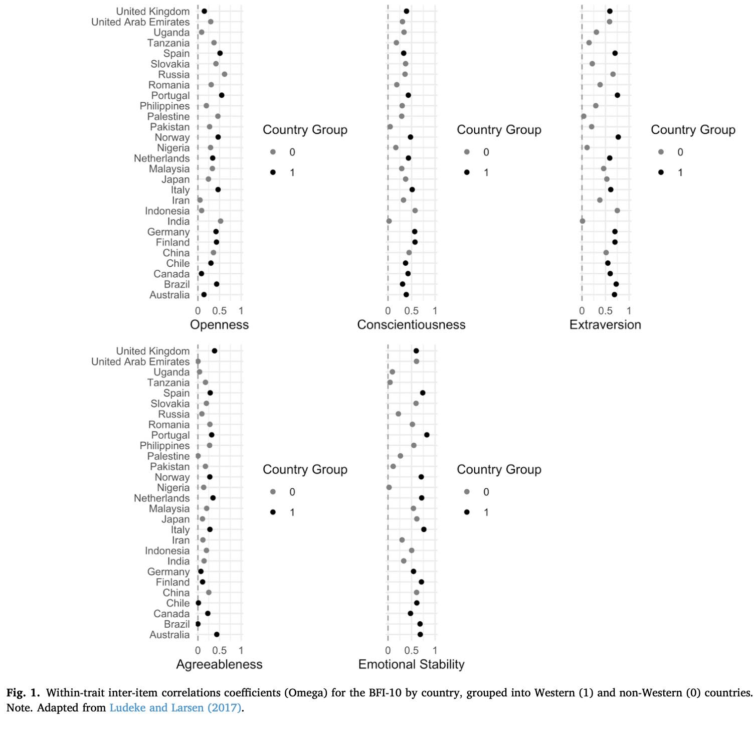
The study provides a comparison of the inter-item correlations of the Big Five Inventory-10 (BFI-10) between Western and non-Western contexts. The issue with the figure in question is the repated information in the key with Country Group. Specifically, when the legend is identical across all panels, you only need to show it once.
In the example above you see how the repeated information is not helping the reader but only creating a lot of white space. Actually, the figure is now in need of two rows to show all panels. If the legend was presented once under the panels, you could have had the five panels on one row.
An additional issue with the legend here is that it is not easy to understand the figure without reading the text related to the figure. What does it mean that Country Group is 1 or 0? It would have been a lot better to say Western and non-Western instead of 1 and 0, and not give the legend a title. Generally, make sure the legend can be read on its own.
As you can see in the title for the figure, it is adapted from Ludeke and Larsen (2017). Park et al. (2022) have used the code from our Figure 1, but the challenge is that we do not use a legend at all. If you use code from other publications (which I think you should when you find great examples), make sure that any changes you make are not only are aligned with the information you need to communicate, but also is not repeating said information.
Do not repeat information – unless you have a very good reason. In most cases, you will not have a good reason.
* Update: September 26, 2022
Jesse Onland shared his version of an improved figure that is not repeating the information. Here it is:
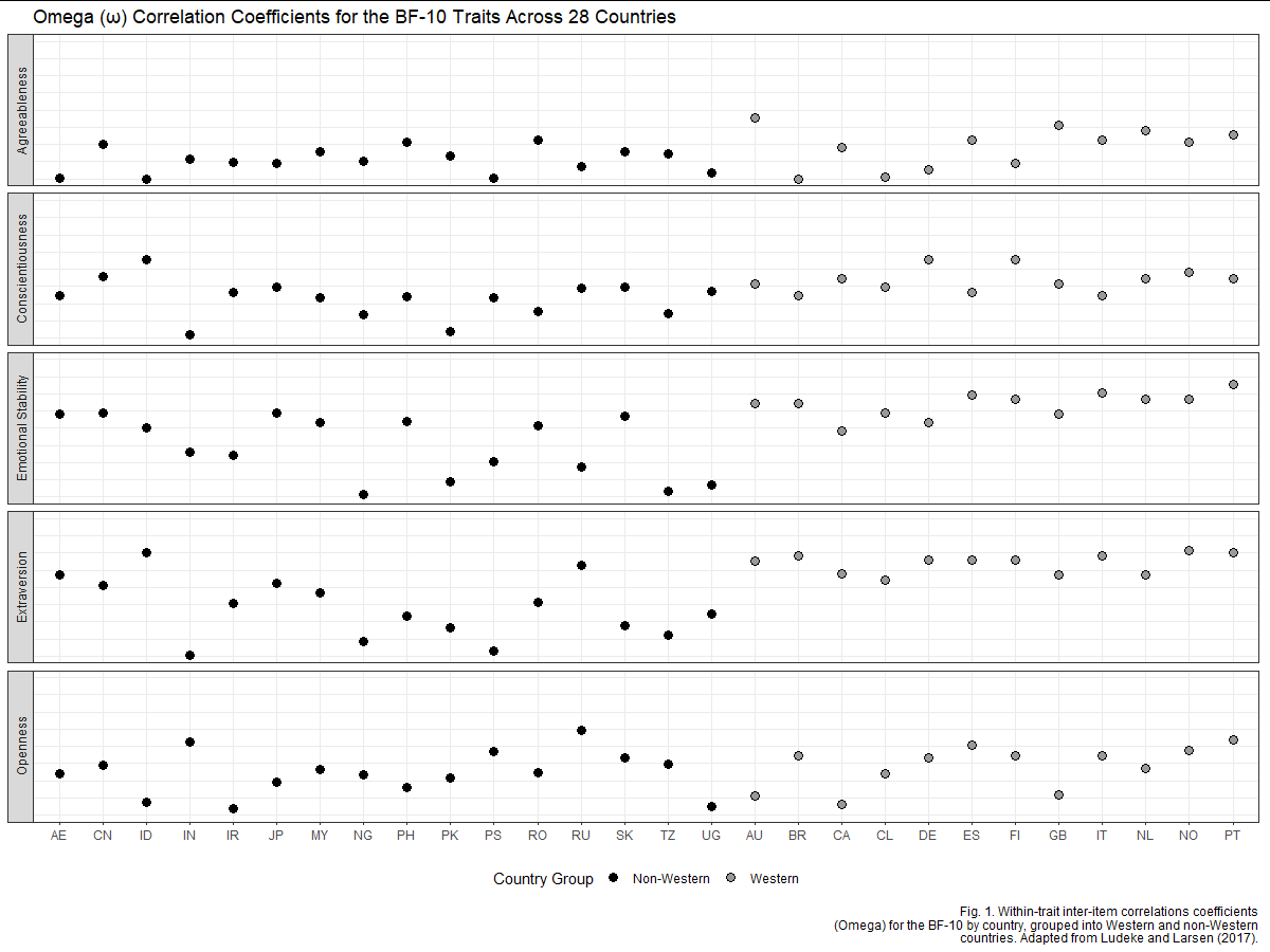
It is indeed an improved figure and it does a great job in showing all relevant information. I also like how the Western and non-Western countries are grouped to make it easier to look at the scores for Western and non-Western countries.
For the country labels, Jesse said: “I’m not certain about the trick of using ISO 3166 ALPHA-2 for the x-axis labels; it makes very efficient use of space but introduces some difficulty in interpretation. A reader may not know, e.g., whether “AU” refers to Austria or to Australia.” I believe it is working here and you often see such abbreviations being used in academic articles. I did try to use his code and add the full country names as two rows on the x-axis, using guide_axis(n.dodge = 2) in ggplot2.
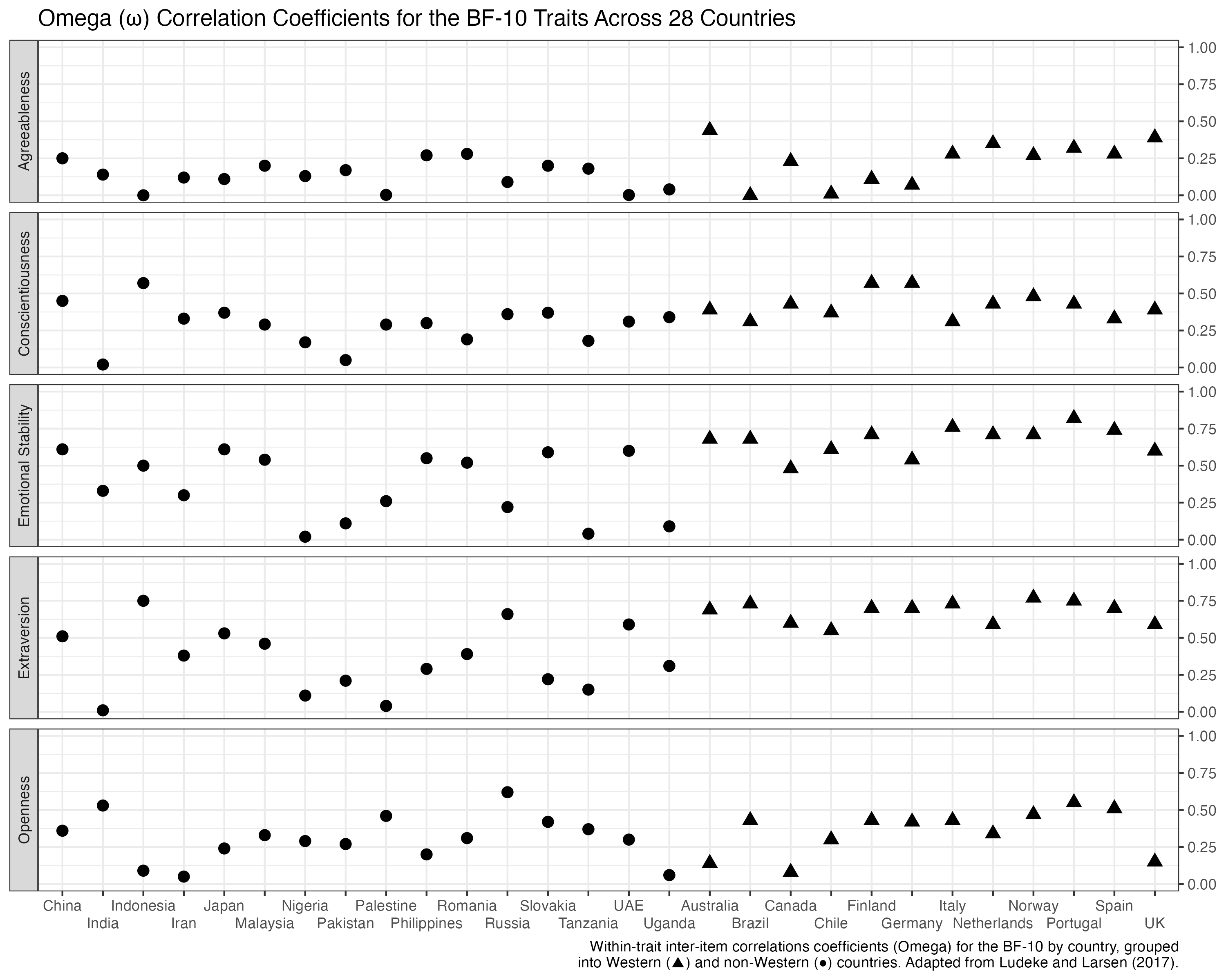
Notice also how I tried to get rid of the legend/key altogether by using shapes (circles and triangles) instead of colours and then integrate this information into the caption. This is more a matter of personal taste but I do like the idea of getting rid of the legend here, especially in a way where the information in the figure can also be integrated into the main text, i.e., that the estimates are grouped into Western (▲) and non-Western (●) countries.
Last, we can also try to present the countries on the y-axis as in Park et al. (2022):
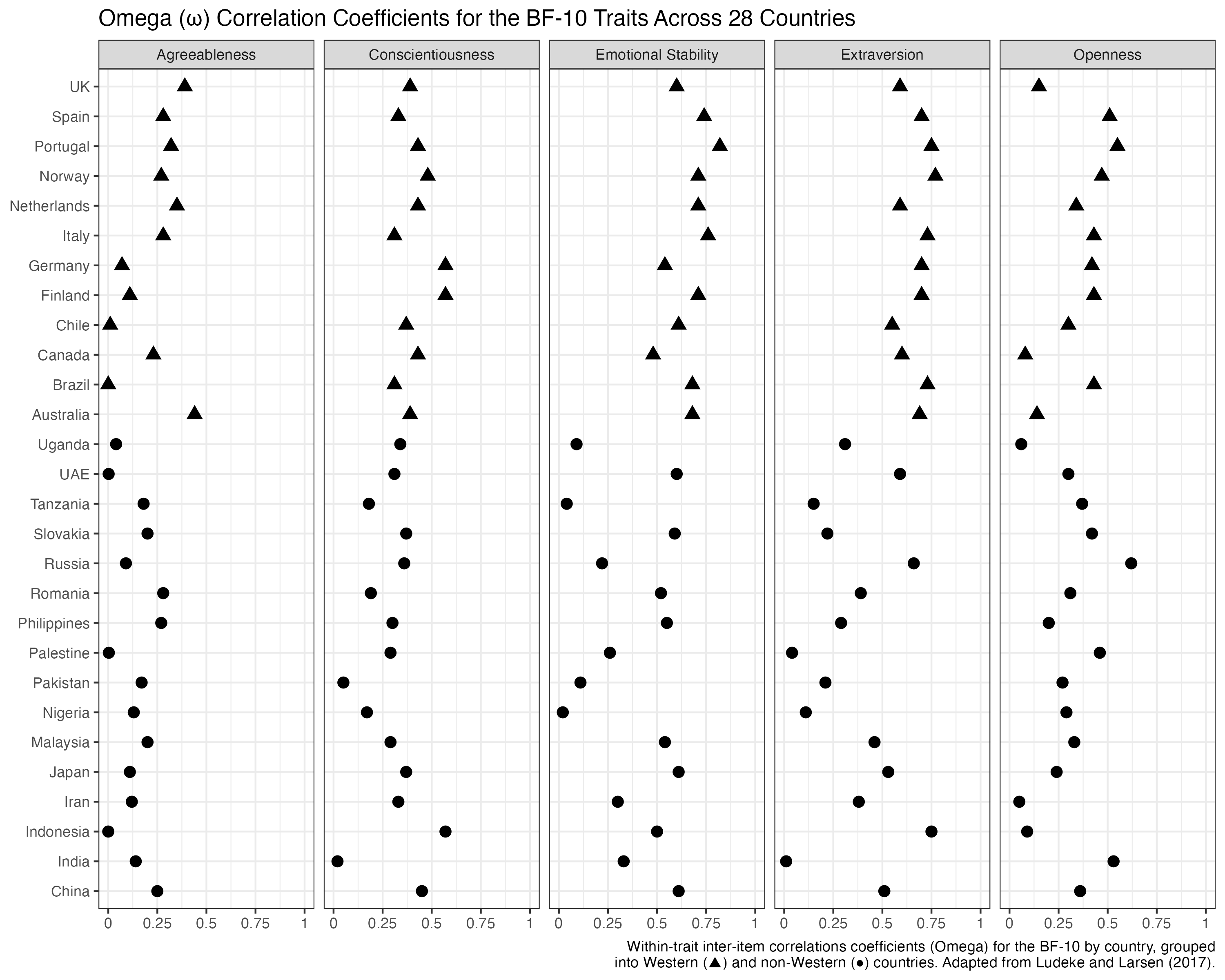
This figure is not repeating information across the five panels that takes up extra space. Accordingly, we are now able to work with five panels on a single row. This also makes it a lot easier to compare the estimates across the different traits.