Climate change is abstract. We do not personally experience climate change in our day-to-day activities (although cimate change is detectable from any single day of weather at global scale, cf. Sippel 2020), and if we are to understand climate change, data – and in particular data visualisation – is crucial. I have recently been reading some literature on the relevance of visualisations and uncertainty in relation to climate change. There has, for example, been some work on the role of visual imagery on public attitudes towards climate change (e.g., Bolsen et al. 2019 and van der Linden et al. 2014) and how uncertainty may make people more likely to accept climate scientists’ predictions (see Howe et al. 2019).
Scientific evidence and data is not enough and we need to consider the best possible ways to visualise climate change. One of the most popular visualisations is the iconic #ShowYourStripes figure that shows global average annual temperatures from 1850 to 2019:

I believe it is a good visualisation but I have a few objections. First and foremost, I like numbers and I do not like how simplified the presentation is. What exactly are the numbers we are looking at here? Should I be concerned? If the dark blue is -0.01°C and the dark red is 0.01°C, is the story here one of change or stability? What is the average temperature in the sample and how much variation is there? Call me old-fashioned, but I don’t think a data visualisation is working if you are simply saying that something is increasing over time.
Interestingly, you can also download the figure with labels, but this provides no information on what values the colours are showing – only the time dimension:
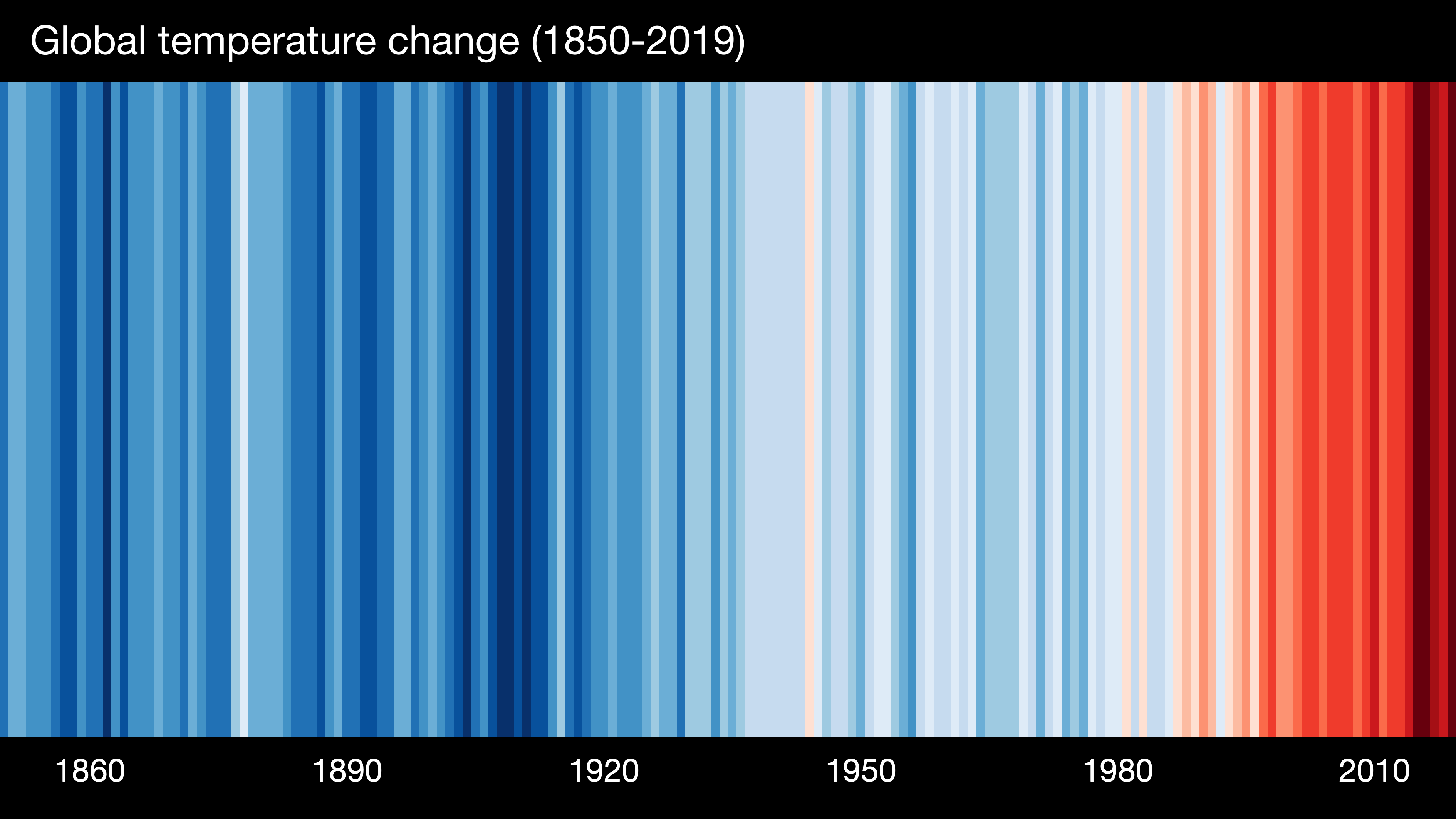
The lack of a meaningful legend is an issue here. It would not make the visualisation more complicated but only help better understand the changes.
Second, I am not convinced that the tool is actually good if you want to show your stripes (and that is what we are being told to do afterall). How useful is the visualisation when we go beyond the global averages? To illustrate my concern, here is the visualisation I got for Denmark:
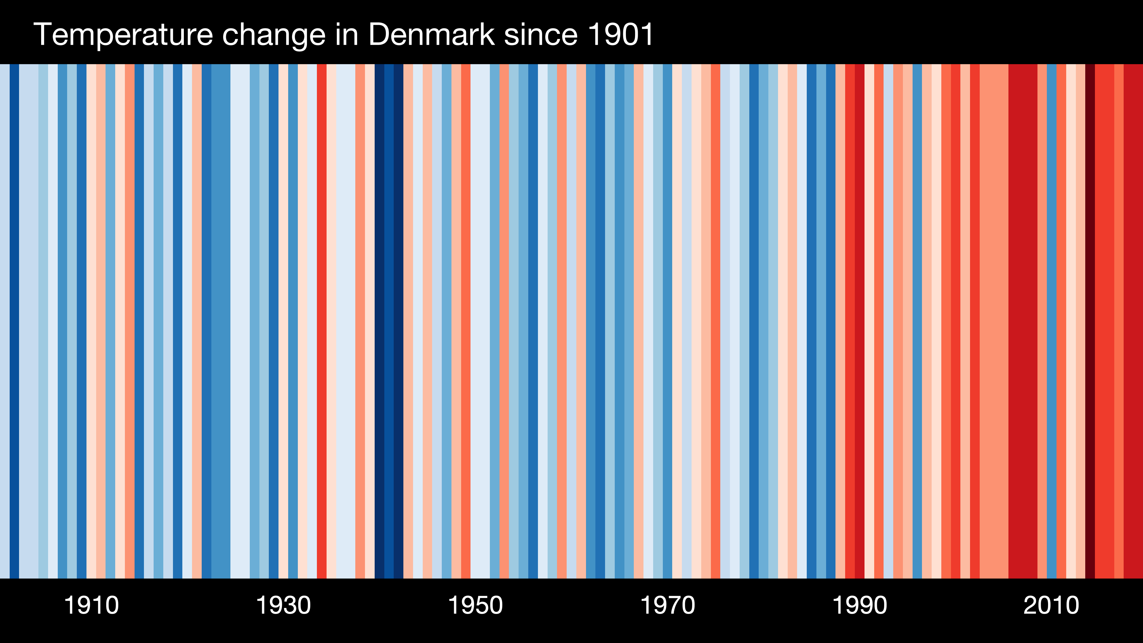
Sure, there is a story to tell, but I begin to miss certain details. Again, what are the values I am looking at? How much variation is there? And most importantly, how much uncertainty is there over time?
Third, I do not like the extreme colour scale used to illustrate the changes from 1850 (or 1901) to 2019. We know that the temperatures are going to increase in the future and the visualisation can give the false impression that we are already at a peak. I know this is not the message that the figure wants to convey, but people might look at the figure and conclude that we have seen the worst of what is to come.
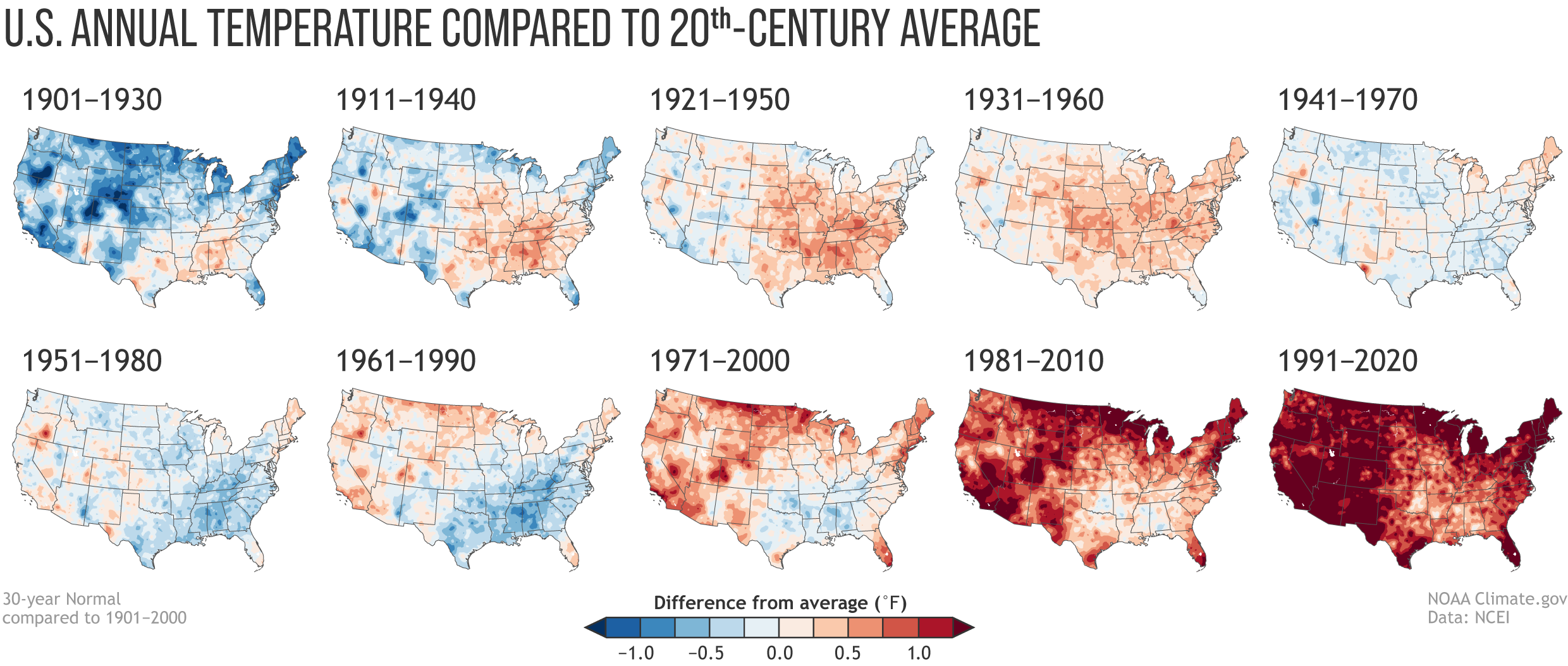
It is not a bad visualisation. However, it is definitely not the best. You can check out the Vis for Future project from 2019 and find a lot of other great visualisations (the ‘Warming Stripes’ was one of the winners). I can also recommend a lot of the work by Neil Kaye, e.g. this and this. A recent example of a good visualisation is this visualisation from the National Oceanic and Atmospheric Administration on annual temperatures compared to the 20th-century average in the United States (notice how the legend is making it easier to see what we are actually looking at):
Climate change is abstract, but good visualisations with labels can help us better understand the global changes in our climate.