Statistics is about learning from data in the context of uncertainty. Often we communicate uncertainty in the form of probabilities. How should we best communicate such probabilities in our figures? The key point in this post is that we should not only present probabilities in the form of probabilities and the like. Instead, we need to work hard on making our numbers tangible.
Why is it not sufficient to simply present estimates on probabilities? Probabilities are difficult because we easily interpret such probabilities differently. When people hear that a candidate is 80% likely to win an election, some people will see that as a much more likely outcome than others. In other words, there are uncertainties in how people perceive uncertainties. We have known for decades that people assign very different probabilities to different probability terms (see e.g. Wallsten et al. 1986; 1988), and the meaning of terms such as “nearly certain” will for one person be close to 100% and for another person be closer to 50%.
To make matters worse, risks and probabiblities can be expressed in different ways. Consider the example of the study that showed how the show “13 Reasons Why” was associated with a 28.9% increase in suicide rates. This was a much more interesting study because they focused on the rate-change in relative terms instead of saying an increase from 0.35 in 100,000 to 0.45 in 100,000 (see also this article on why you should not believe the study in question). To illustrate such differences, @justsaysrisks reports the absolute and relative risk from different articles communicating research findings.
In David Spiegelhalter’s great book, The Art of Statistics: Learning From Data, he looks at how the risk of getting bowel cancer increases by 18% for a group of people who eat 50g of processed meat a day. In Table 1.2 in the book, Spiegelhalter shows how a difference between two groups in one percentage point can be turned into a relative risk of 18%:
| Method | Non-bacon eaters | Daily bacon eaters |
| Event rate | 6% | 7% |
| Expected frequency | 6 out of 100 | 7 out of 100 |
| 1 in 16 | 1 in 14 | |
| Odds | 6/94 | 7/93 |
| Comparative measures | |
| Absolute risk difference | 1%, or 1 out of 100 |
| Relative risk | 1.18, or an 18% increase |
| ‘Number Needed to Treat’ | 100 |
| Odds ratio | (7/93) / (6/94) = 1.18 |
As you can see, event rates of 6% and 7% in the two groups with an absolute risk difference of 1% can be turned into a relative risk of 18% (with an odds ratio of 1.18). Spiegelhalter’s book provides other good examples and I can highly recommend it.
Accordingly, probabilities are tricky and we need to be careful in how we communicate them. We have seen a lot of discussions on how best to communicate electoral forecasts (if the probability that a candidate will win more than 50% of the votes is 85%, how confident will people be that the candidate will win?). One great suggestion offered by Spiegelhalter in his book is to not think about percentages per se, but rather make probabilities tangible by showing the outcomes for, say, 100 people (or 100 elections, if you are working on a forecast).
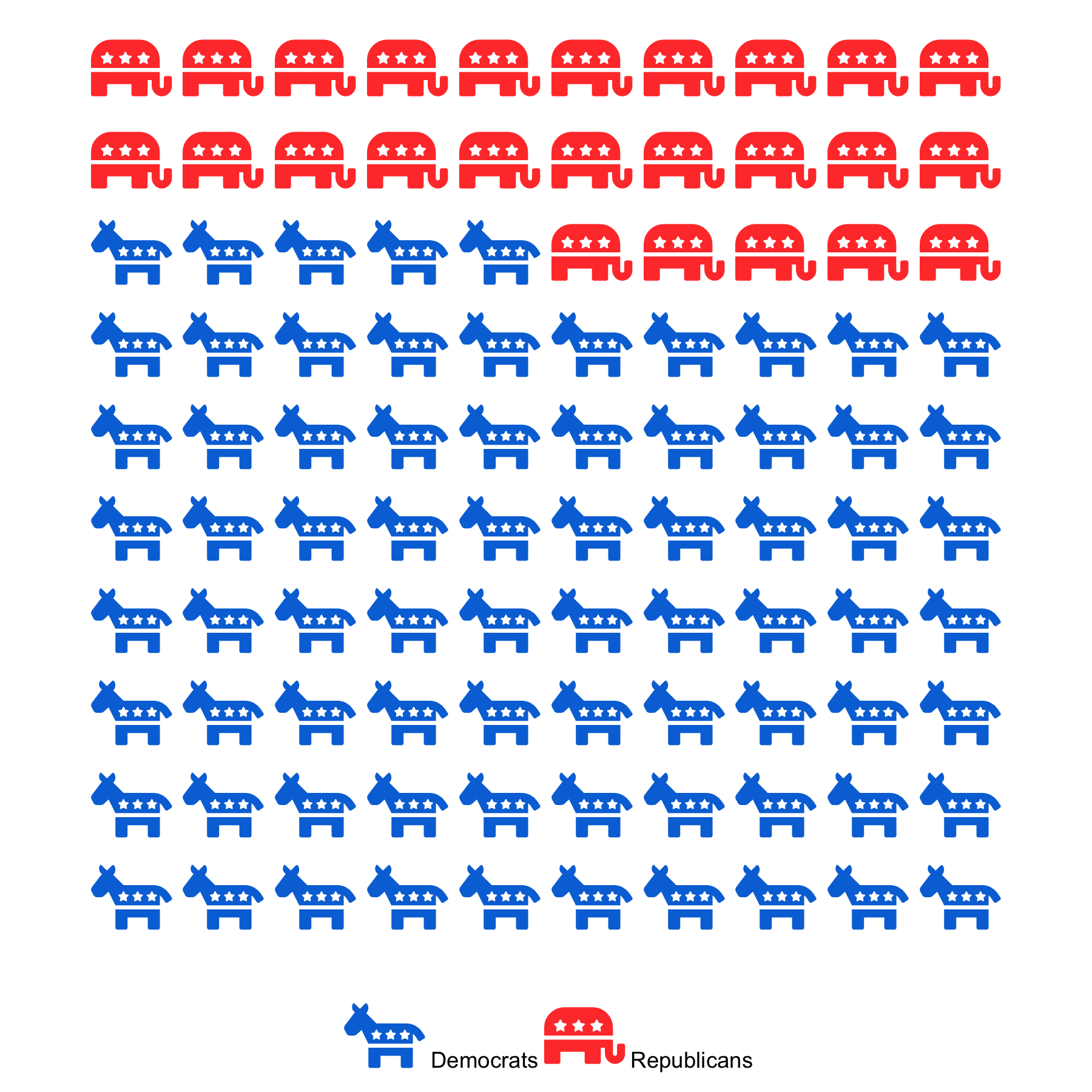
To do this, we use unit charts to show counts of a variable. Here, we can use a 10×10 grid where each cell represents one percentage point. A specific version of the unit chart is an isotype chart, where we use icons or images instead of simple shapes.
There is evidence that such visualisations work better than simply presenting the information numerically. Galesic et al. (2009) show, in the context of medical risks, how icon arrays increase the accuracy of the understanding of risks (see also Fagerlin et al. 2005 on how pictographs can reduce the undue influence of anecdotal reasoning).
When we hear that the probability that the Democrats will win an election is 75%, we think about the outcome of one election and how that is significantly more likely to happen. However, when we use an isotype chart where we show 100 outcomes, 75 of them being won by the Democrats, we make the 25 out of 100 Republican outcomes more salient.
There are different R packages you can use to make such visualisations, e.g. waffle and ggwaffle. In the figure below, I used the waffle package to demonstrate how the Democrats got a probability of 75% of winning a (hypothetical) election.
There are many different ways to communicate probabilities. However, try to avoid simply presenting the numerical probabilities in your figures, or the odds ratios, and consider how you can make the probabilities more tangible and easier for the reader to process.