Most static figures show information in two dimensions (with a horisontal dimension and a vertical dimension). This works really well on the screen as well as on paper. However, once in a while you also see figures presenting figures with a third dimension (3D). It is not necessarily a problem adding a third dimension if you are actually using it to visualise additional data in a meaningful manner. If you have three continuous variables constituting a space, it can make sense to show how observations are positioned in this space. Take for example this figure generated from the interflex package in R:
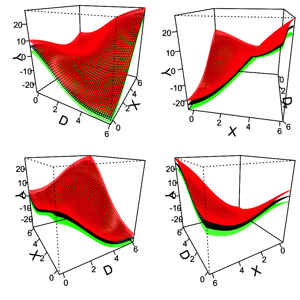
However, unless you have a clear plan for how, and specifically why, you want to present your data in three dimensions, my recommendation is to stick to two dimensions. I will, as always, present a few examples from the peer-reviewed scientific literature. These are not necessarily bad figures, just figures where I believe not having the third dimension would significantly improve the data visualisation.
First, take a look at a bar chart from this article on the willingness to trade off civil liberties for security before and after the 7/7 London terrorist attack:
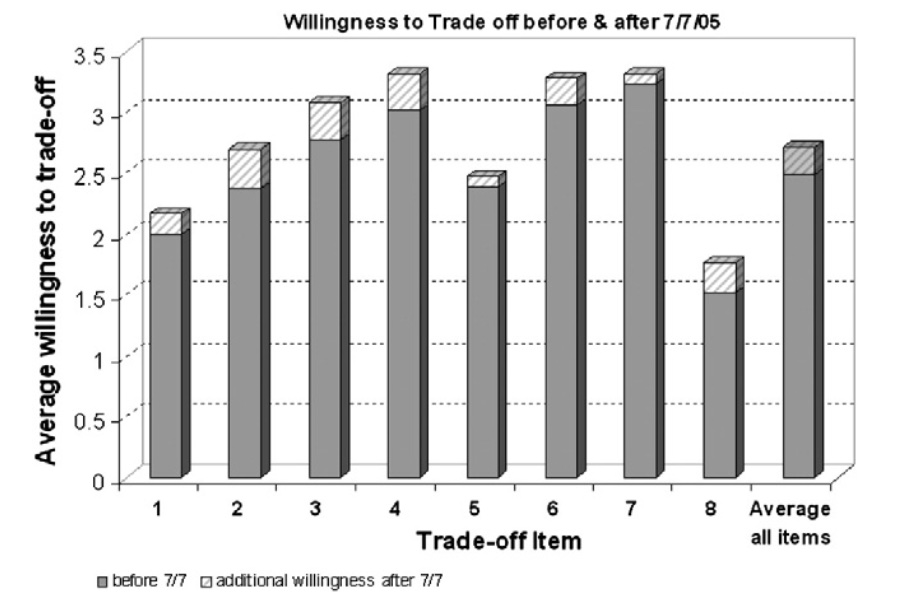
The third dimension here is not adding anything of value to the presentation of the data. On the contrary, it is difficult to see whether item 3 is greater than or equal to 3 on the average willingness to trade-off. As Schwabish (2014) describes in relation to the use of 3D charts: “the third dimension does not plot data values, but it does add clutter to the chart and, worse, it can distort the information.” This is definitely the case here.
Second, let us look at a figure from this article showing correlations between voting preferences and ten distinct values:
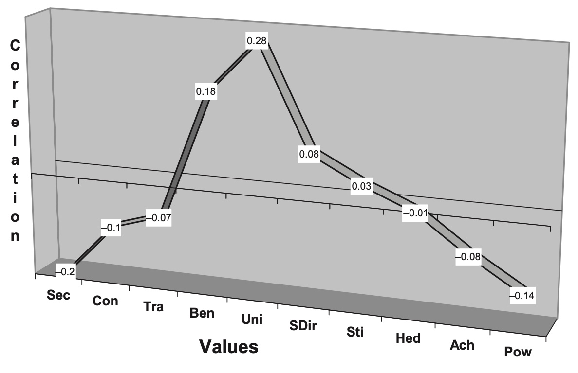
Again, the third dimension is not adding anything of value to the visualisation. It is only making it more difficult to compare the values. The good thing about the figure is that it shows the exact values. However, it would be much better to present the information in a simple bar chart like this one:
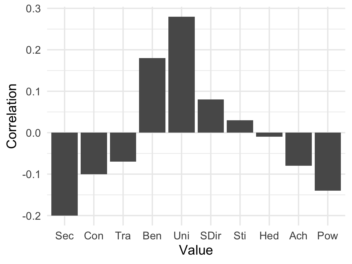
In the figure above, I show the values without the use of any third dimension. Notice how it is easier to identify the specific values (e.g. “Uni”) in the bar chart compared to the 3D chart, when we do not need to move our eyes in a three-dimensional space.
Third, let us look at an example from this article where we actually add additional information to the third dimension:
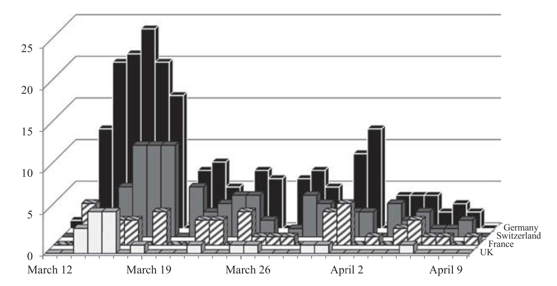
The figure shows the number of articles referring to domestic nuclear energy in four different countries from March 12, 2011 to April 10, 2011. However, it is very difficult to compare the numbers in the different countries, and if there are more articles in the UK and/or France than in Switzerland, we will not be able to see how many articles there are in the latter country. This is not a good visualisation. Instead, it would have been better with a simple line graph in two dimensions.
Again, there can be good reasons to visualise information in three dimensions, but unless you have very good reasons to do so, my recommendation is to keep it simple in 2D. In other words, in most cases, 2D > 3D.