In academic papers nowadays you will see that researchers – for good reasons – prefer to use figures instead of tables to present data and results. It is usually a lot easier and better to convey a point (or even multiple points) with a figure compared to a good table.
However, as anybody who have tried to collect data for a meta-analysis will know, it is amazing when a paper is presenting actual numbers in a systematic manner (especially if the replication material is not available). That is one of the things I like about tables. You have the numbers when you need them and you do not need to eyeball multiple lines to estimate what a number most likely is in a figure.
There is no reason to exclude actual numbers from figures. On the contrary, including numbers in figures is easy and will in most cases communicate your data in a better manner. This goes for most types of figures, but in this post I will focus on a few simple examples in the form of bar charts in recently published articles (it only took me a few minutes to find a few examples).
First, consider Figure 1 in Heinzel et al. (2024) with a simple bar chart showing the distribution of an index of interest. There are four different categories (0, 1, 2, and 3), and each bar shows the percentage of observations within each category.
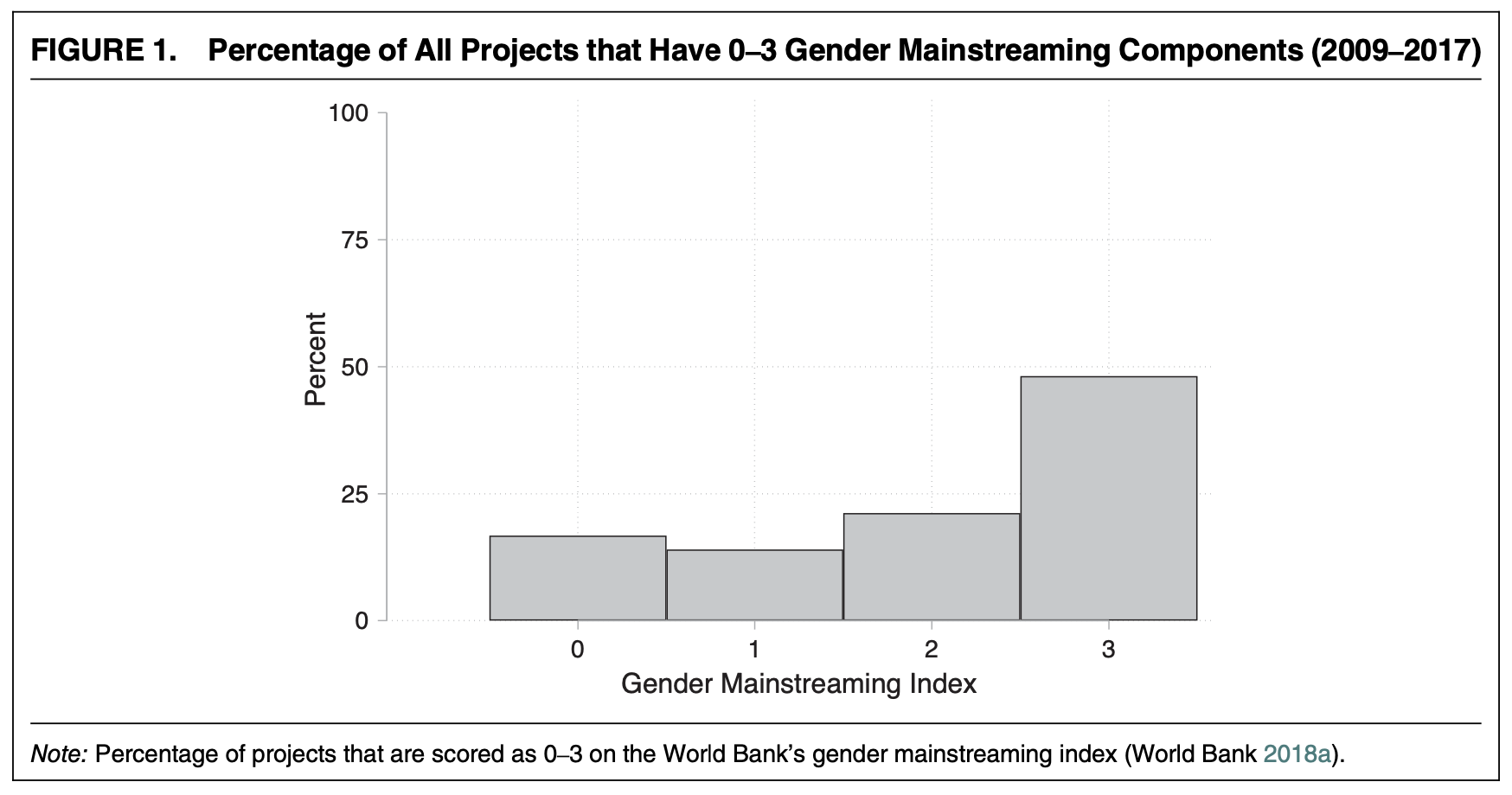
The figure is made with Stata but I found it relatively easy to reproduce the figure in R. Once I had the figure, I added the percentages on the figure. This makes it a lot easier to communicate the numbers, and there is no need to mention the respective numbers in the text (something the article in question is not doing anyway).
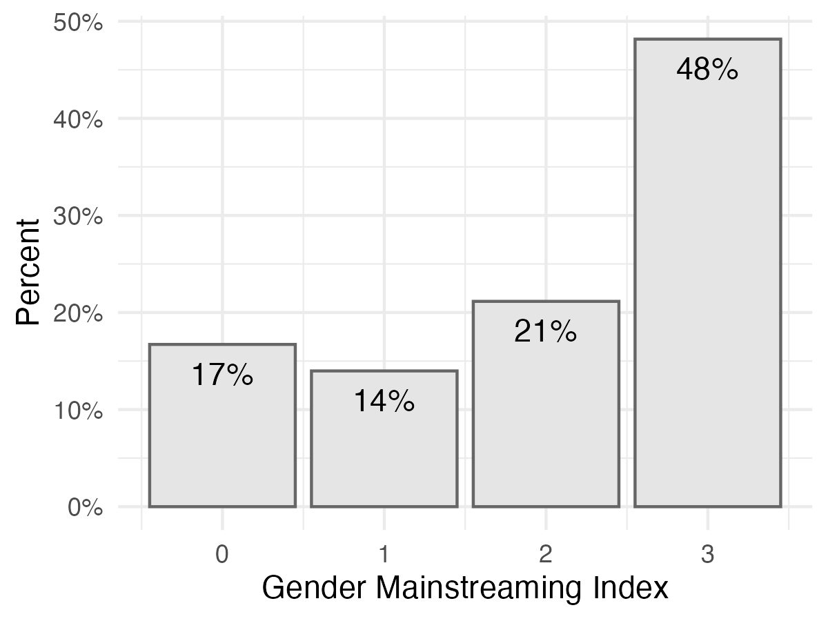
I prefer ggplot2::geom_col() in R over histogram in Stata/SE, not only because it is not setting me back $925 USD per year, but also because it makes it easier to see that we are not working with a histogram by default. In general, when working with a bar chart, it is good to include a bit of space between the bars to indicate that it is not a continuous variable.
Second, consdier Figure 2 in Anoll et al. (2024). This figure also shows the distribution in the form of percentages, but in this case for two groups of respondents.
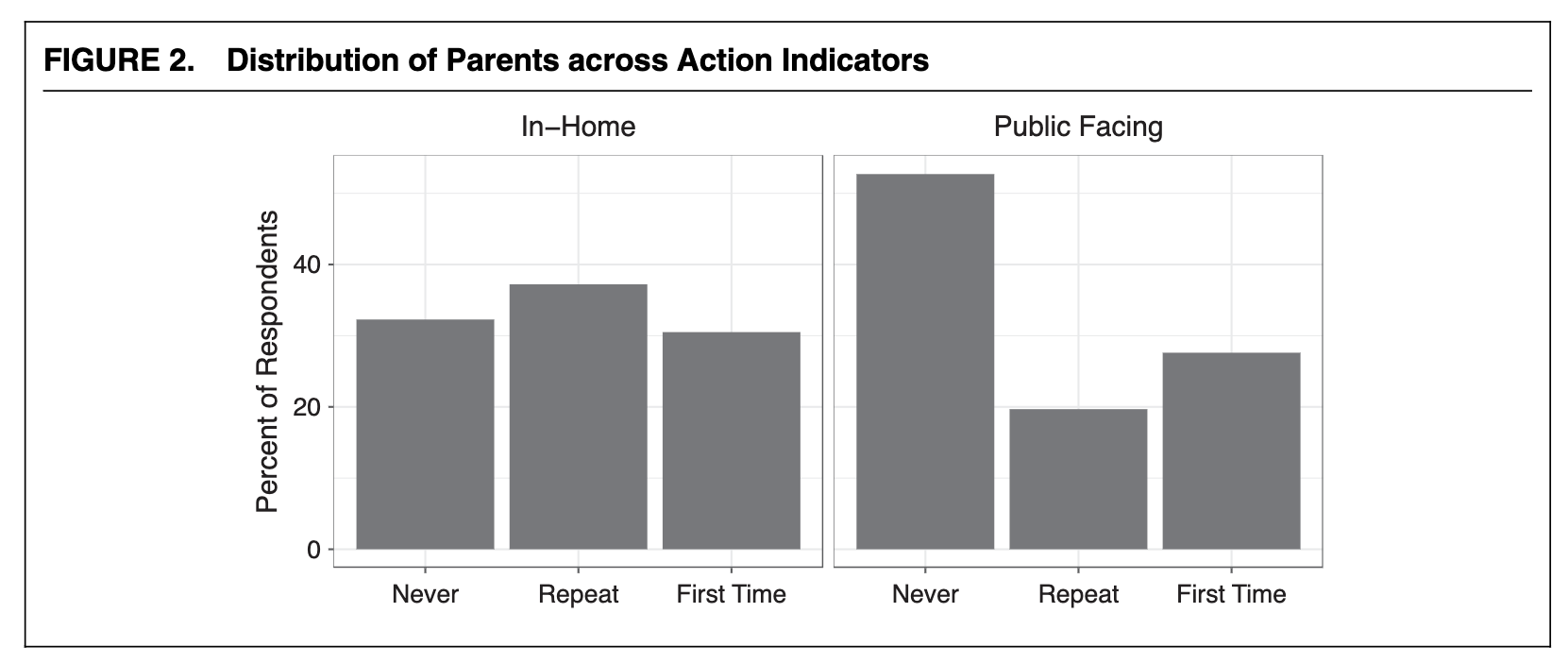
The figure is made with {ggplot2} and I simplified the R code to reproduce the figure. Here is the code and the figure:
samp_props |>
    ggplot(aes(x = group,
               y = share)) +
    geom_col() +
    facet_wrap(~ action) +
    labs(x = NULL, y = "Percent of Respondents") +
    theme_bw()
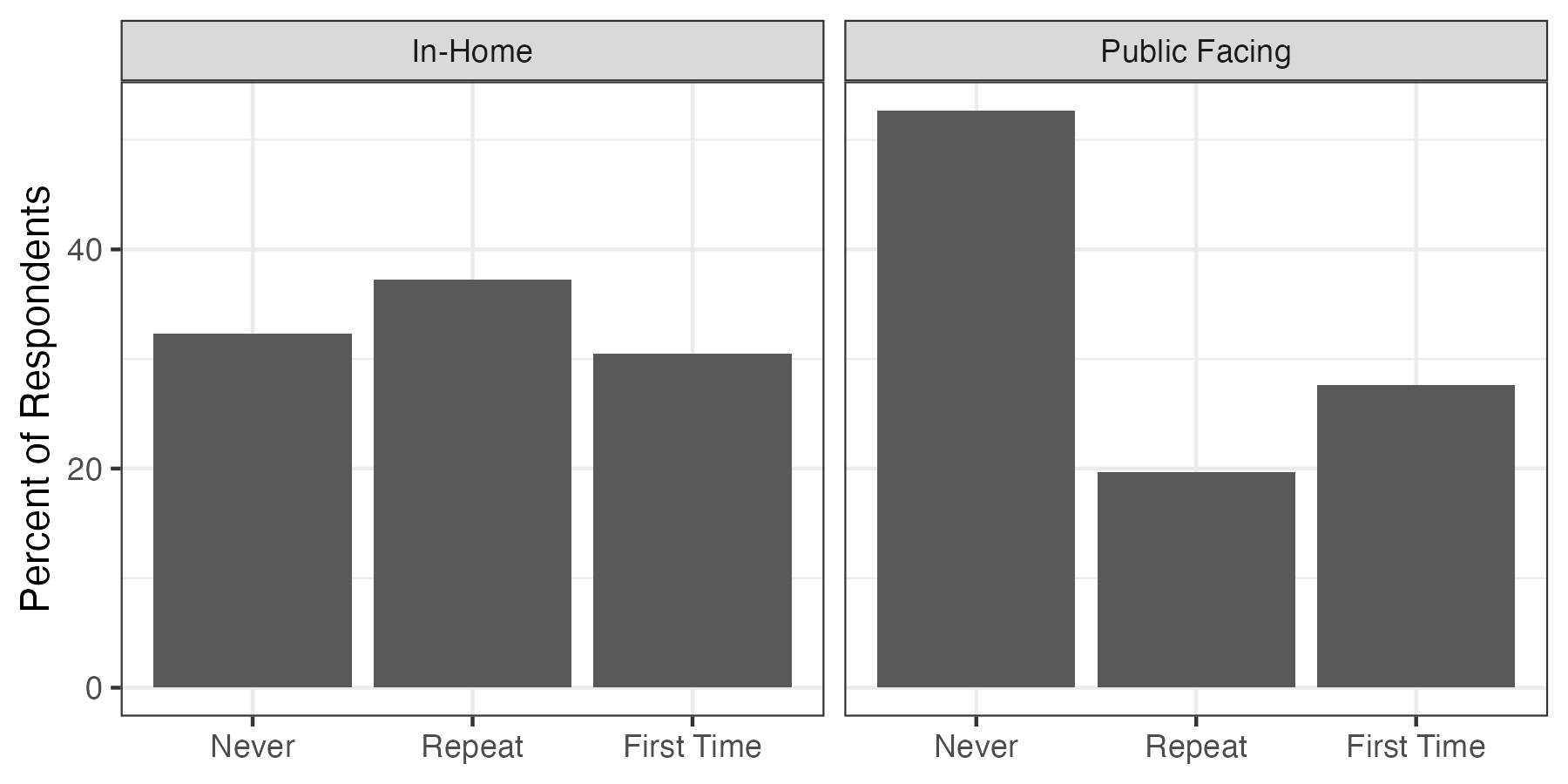
Once we have a figure like this, it only takes a few extra lines of code to add the numbers to the figure. I do this in the example below. First, in the aes(), you will need to use the label argument to specify the variable you want to show the numbers for (line 4 in the code below). Notice that I also round the number to not show too many decimal places. Second, using geom_text(), you can plot the actual numbers (line 6 in the code below). Notice that I here change the location on the y-axis and give the text a white colour.
samp_props |>
    ggplot(aes(x = group,
               y = share,
               label = round(share, 1))) +
    geom_col() +
    geom_text(aes(y = share - 5), colour = "white") +
    facet_wrap(~ action) +
    labs(x = NULL, y = "Percent of Respondents") +
    theme_bw()

There are different R packages available that can help you with including additional information in your figures if you use ggplot2, such as {geomtextpath}, {ggrepel}, and {ggfittext}. For the latter, I especially like the function geom_bar_text() to easily include numbers in bar charts.
This is usually all it takes. Nothing more, nothing less. And it provides a lot of useful details for the (interested) reader. Of course, it can be more difficult with different types of figures and data types, and do not add too many numbers for the sake of adding numbers, but if you do not show any numbers in your figures, consider whether it might be a low-hanging fruit in order to improve your figure.